

Visual types in Insights
Insights offers a range of visual types that you can use to display your data. Use the links in the Related topics section to learn more about the capabilities of each visual type.
Prerequisites
-
You have the Insights Author license.
Page location
Insights > Analyses > Click an analysis
Measures and dimensions
We use the term measure to refer to numeric values that you use for measurement, comparison, and aggregation in visuals. A measure can be either a numeric field, like product cost, or a numeric aggregate on a field of any data type, like count of transaction IDs.
We use the term dimension or category to refer to text or date fields that can be items, like products, or attributes that are related to measures and can be used to partition them. Examples are sales date for sales figures or product manufacturer for customer satisfaction numbers. Insights automatically identifies a field as a measure or a dimension based on its data type.
Numeric fields can act as dimensions, for example ZIP codes and most ID numbers.
You can change whether a field is displayed as a dimension or measure on an analysis-by-analysis basis instead. For more information, see the “Fields as dimensions and measures” section in Add visuals to Insights analyses.
Display limits
All visual types limit the number of data points they display so that the visual elements (like lines, bars, or bubbles) are still easy to view and analyze. The visual selects the first n number of rows for display up to the limit for that visual type. The selection is either according to sort order, if one has been applied, or in default order otherwise.
The number of data points supported varies by visual type. To learn more about display limits for a particular visual type, see the topic for that type in the Related topics section.
The visual title identifies the number of data points displayed if you have reached the display limit for that visual type. If you have a large dataset and want to avoid running into the visual display limit, use one or more filters to reduce the amount of data displayed. For more information about using filters with visuals, see Filter data in Insights.
For dashboards and analyses, Insights supports the following:
- 50 datasets per dashboard
- 20 sheets per dashboard
- 30 visualization objects per sheet
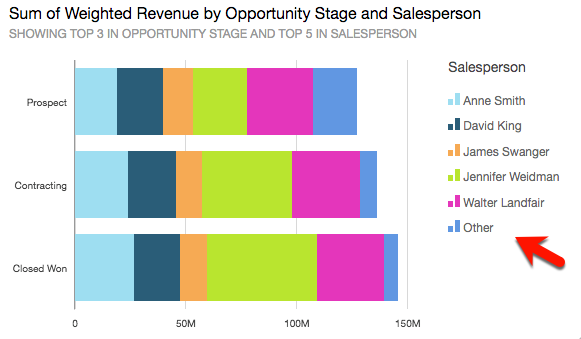
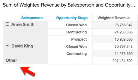
You can also choose to limit how many data points you want to display in your visual before they are added to the other category. This category contains the aggregated data for all the data beyond the cutoff limit for the visual type you are using—either the one you impose or the one based on display limits. You can use the on-visual menu to choose whether to display the other category. The other category doesn't appear on scatter plots, heat maps, maps, tables (tabular reports), or key performance indicators (KPIs). It also doesn't show on line charts when the x-axis is a date. Drilling down into the other category is not supported.
The following image shows the other category on a bar chart.
The following image shows the other category on a pivot table.
Procedures
Hide or display the "other" category
- Click Menu options (the three dots in the upper-right corner of the visual).
- Select Hide “other” categories or Show “other” categories.
Customize the number of data points to display
You can choose the number of data points to display on the main axis of some visuals. After this number is displayed in the chart, any additional data points are included in the "other" category. For example, if you choose to include 10 data points out of 200, 10 display in the chart and 190 become part of the "other" category.
- Click Format visual (the graph icon in the upper-right corner of the visual). The Properties panel opens.
-
Use the following table to determine which field well contains the data point setting and what number of data points the visual type displays by default.
Visual type Where to find the data point setting Default number of data points Bar chart, horizontal Y-axis – Number of data points displayed 2,500 Bar chart, vertical X-axis – Number of data points displayed 2,500 Combo chart X-axis – Number of data points displayed 2,500 Heat map Rows – Number of rows displayed
Columns – Number of columns displayed
100 Line chart X-axis – Number of data points displayed 10,000 Pie chart Group/Color – Number of slices displayed 20 Tree map Group by – Number of squares displayed 100
- Use AutoGraph
- Use bar charts
- Use box plots
- Use combo charts
- Use custom visual content
- Use donut charts
- Use funnel charts
- Use gauge charts
- Use heat maps
- Use histograms
- Use KPIs
- Use line charts
- Create maps in Insights
- Use small multiples
- Use pie charts
- Use pivot tables
- Use radar charts
- Use Sankey diagrams
- Use scatter plots
- Use tables as visuals
- Use text boxes
- Use tree maps
- Use waterfall charts
- Use word clouds
- Add visuals to Insights analyses
- Format a visual in Insights
- Customizing data presentation