

Use radar charts
Prerequisites
-
You have the Insights Author license.
Page location
Insights > Analyses > Click an analysis
You can use radar charts, which are also known as spider charts, to visualize multivariate data in Insights. In a radar chart, one or more groups of values are plotted over multiple common variables. Each variable has its own axis, and each axis is arranged radially around a central point. The data points from a single observation are plotted on each axis and connected to each other to form a polygon. Multiple observations can be plotted in a single radar chart to display multiple polygons, which makes it easier to spot outlying values for multiple observations quickly.
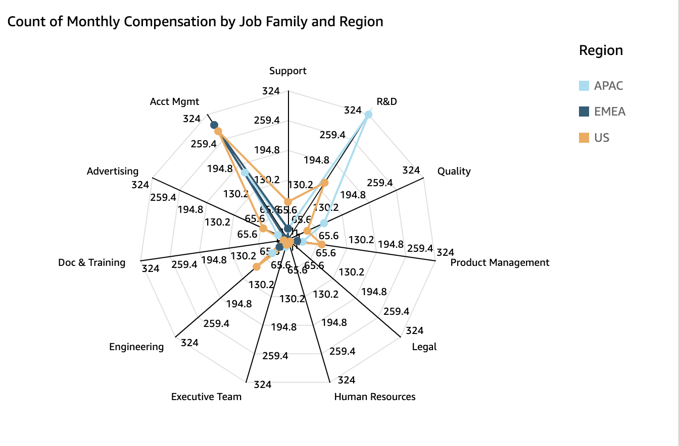
The following image shows an example of a radar chart.
Procedure
Create a radar chart
- Click Visualize (the bar chart icon in the tool bar). The Visuals panel opens.
- Click Add.
-
Click the Radar Chart icon.

-
Drag fields from the Data panel into the field wells. The way that you place fields in the different field wells determines the axis that a radar chart is organized around:
- In a radar chart that uses a value axis, dimension values are shown as lines, and axes represent value fields. To create a radar chart that uses a value axis, drag one dimension into the Color field well and at least one value into the Value field well.
- In a radar chart that uses a dimension axis, group dimension values are shown as axes, and value fields are shown as lines. All axes share a range and scale. To create a radar chart that uses a dimension axis, drag one dimension into the Group field well and at least one value into the Value field well.
- In a radar chart that uses a dimension-color axis, group dimension values are shown as axes, and color dimension values are shown as lines. All axes share a range and scale. To create a radar chart that uses a dimension-color axis, drag one dimension into the Category field well, one value into the Value field well, and one dimension into the Color field well.
Radar chart features
The following table lists the actions you can do with radar charts.
| Feature | Supported? | Comments | For more information |
|---|---|---|---|
| Change the legend display | Yes | Legends on visual types in Insights | |
| Change the title display | Yes | Format visual titles and subtitles in Insights | |
| Change the axis range | Yes | Set the range and scale on visuals in Insights | |
| Change the visual colors | Yes | Colors in visual types in Insights | |
| Focus on or exclude elements | Yes | ||
| Sort | Limited | You can only sort data fields that are in the Category and Color field wells. | Sorting visual data in Insights |
| Perform field aggregation | Yes | Changing field aggregation | |
| Add drill-downs | Not supported | Adding drill-downs to visual data in Insights | |
| Choose size | Yes | Format a visual in Insights | |
| Show totals | Not supported | Format a visual in Insights |
Related topics