

Use histograms
Prerequisites
-
You have the Insights Author license.
Page location
Insights > Analyses > Click an analysis
Use a histogram chart in Insights to display the distribution of continuous numerical values in your data. Insights uses un-normalized histograms, which use an absolute count of the data points or events in each bin.
BEST PRACTICE Make sure that you adjust the format settings so that you have a clearly identifiable shape. If your data contains outliers, this becomes clear if you spot one or more values off to the side of the X-axis. For information about how Insights handles data that falls outside display limits, see the “Display limits” section in Visual types in Insights.
Procedures
Create a histogram
- Click Visualize (the bar chart icon in the tool bar). The Visuals panel opens.
- Click Add.
-
Click the Histogram icon.

- Drag a measure from the Data panel into the Group By field well. The resulting histogram shows the following:
- The X-axis displays 10 bins by default, representing the intervals in the measure that you choose. To customize the bins, see Format a histogram.
- The Y-axis displays the absolute count of individual values in each bin.
-
Hover over the histogram chart that you want to work with and click Format visual (the bar chart icon on the upper-right corner of the visual). The Properties panel opens.
-
Set the following options to control the display of the histogram:
-
Expand Histogram. Chose one of the following settings. You can format the bins either by count or width, not both together.
- Bin count: The number of bins that display on the X-axis.
-
Bin width: The width (or length) of each interval. This setting controls the number of items or events to include in each bin.
EXAMPLE If your data is in minutes, you can set this to 10 to show 10-minute intervals.
-
With the following settings, you can explore the best way to format the histogram for your dataset.
EXAMPLE In some cases, you might have a tall peak in one bin while most of the other bins look sparse. This isn't a useful view.
You can use the following settings individually or together:
- Insights displays up to 100 bins (buckets) by default. If you want to display more (up to 1,000), change the X-axis setting for Number of data points to show.
-
Enable Logarithmic Scale in the Y-axis settings.
Sometimes your data doesn't fit the shape that you want, and this mismatch can provide misleading results.
EXAMPLE If the shape is skewed so far to the right that you can't read it properly, you can apply a log scale to it. Doing this doesn't normalize your data, but it does reduce the skew.
-
Display Data labels.
You can enable the display of data labels to see the absolute counts in the chart. Even if you don't want to display these in most cases, you can enable them while you're developing an analysis. The labels can help you decide on formatting and filtering options because they reveal counts in bins that are too small to stand out.
To see all the data labels, even if they overlap, enable Allow labels to overlap.
-
- (Optional) Change other visual settings. For more information, see Format a visual in Insights.
Histogram features
The following table lists the actions you can do with histograms.
| Feature | Supported? | Comments | For more information |
|---|---|---|---|
| Change the legend display | No | Legends on visual types in Insights | |
| Change the title display | Yes | Format visual titles and subtitles in Insights | |
| Change the axis range | No | However, you can change the bin count or the bin interval width (range of distribution). | |
| Show or hide axis lines, grid lines, axis labels, and axis sort icons | Yes | Format axes and grid lines on visual types in Insights | |
| Changing the visual colors | Yes | Colors in visual types in Insights | |
| Focus on or exclude elements | No | ||
| Sort | No | ||
| Perform field aggregation | No | Histograms use only the count aggregation. | |
| Add drill-downs | No |
How histograms work
Although histograms look similar to bar charts, they are very different. In fact, the only similarity is their appearance because they use bars. On a histogram, each bar is called a bin or a bucket.
Each bin contains a range of values called an interval. When you pause on one of the bins, details about the interval appear in a tooltip that shows two numbers enclosed in glyphs. The type of enclosing glyphs indicates if the numbers inside them are part of the interval that's inside the selected bin, as follows:
- A square bracket next to a number means that the number is included.
- A parenthesis next to a number means that the number is excluded.
The first bar in a histogram displays the following notation.
[1, 10)
The square bracket means that the number 1 is included in the first interval. The parenthesis means that the number 10 is excluded.
In the same histogram, a second bar displays the following notation.
[10, 20)
In this case, 10 is included in the second interval, and 20 is excluded. The number 10 can't exist in both intervals, so the notation shows us which one includes it.
The pattern used for marking intervals in a histogram comes from standard mathematical notation. The following examples show the possible patterns, using a set of numbers that includes 10, 20, and every number in between.
- [10, 20] – This set is closed. It has hard boundaries on both ends.
- [10, 21) – This set is half open. It has a hard boundary on the left and a soft boundary on the right.
- (9, 20] – This set is half open. It has a soft boundary on the left and a hard boundary on the right.
- (9, 21) – This set is open. It has soft boundaries on both ends.
Because the histogram uses quantitative data (numbers) rather than qualitative data, there's a logical order to the distribution of the data. This is called a shape. Bins that contain a higher number of values form a peak. Bins that contain a lower number of values form a tail on the edge of a chart and a valley between peaks. Most histograms fall into one of the following shapes:
-
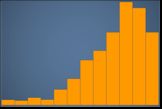
Asymmetrical or skewed distributions have values that cluster near the left or the right—the low or high end of the X-axis. The direction of skewness is defined by where the longer tail of the data is, not by where the peak is. It's defined this way because this direction also describes the location of the mean (average). In skewed distributions, the mean and the median are two different numbers. The different types of skewed distribution are as follows:
-
Negatively skewed or left skewed – A chart that has the mean to the left of the peak. It has a longer tail to the left and a peak to the right, sometimes followed by a shorter tail. The following histogram displays a left-skewed distribution.
-
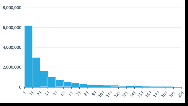
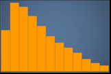
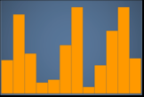
Positively skewed or right skewed – A chart that has the mean to the right of the peak. It has a longer tail to the right and a peak to the left, sometimes preceded by a shorter tail. The following histogram displays a right-skewed distribution.
-
-
Symmetrical or normal distributions have a shape that's mirrored on each side of a center point (for example, a bell curve). In a normal distribution, the mean and the median are the same value. The different types of normal distribution are as follows:
-
Normal distribution, or unimodal – A chart that has one central peak representing the most common value. This is commonly called a bell curve or a Gaussian distribution. The following histogram displays a normal distribution.

-
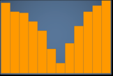
Bimodal – A chart that has two peaks representing the most common values. The following histogram displays a bimodal distribution.
-
Multimodal – A chart that has three or more peaks representing the most common values. The following histogram displays a multimodal distribution.
-
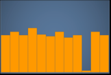
Uniform – A chart that has no peaks or valleys, with a relatively equal distribution of data. The following histogram displays a uniform distribution.
-
The following table shows how a histogram differs from a bar chart.
| Histogram | Bar chart |
|---|---|
| A histogram displays the distribution of values in one field. | A bar chart compares the values in one field, grouped by dimension. |
|
A histogram sorts values into bins that represent a range of values. EXAMPLE 1–10, 10–20, and so on. |
A bar chart plots values that are grouped into categories. |
| The sum of all bins equals exactly 100% of the values in the filtered data. | A bar chart isn't required to display all of the available data. You can change display settings at the visual level. For example, a bar chart might show only the top 10 categories of data. |
| Rearranging bars detracts from the meaning of the chart as a whole. | Bars can be in any order without changing the meaning of the chart as a whole. |
| There are no spaces between the bars, to represent the fact this is continuous data. | There are spaces between the bars, to represent the fact that this is categorical data. |
| If a line is included in a histogram, it represents the general shape of the data. | If a line is included in a bar chart, it's called a combo chart, and the line represents a different measure than the bars. |
Related topics