

Use bar charts
Prerequisites
-
You have the Insights Author license.
Page location
Insights > Analyses > Click an analysis
Insights supports the following types of bar charts, with either horizontal or vertical orientation:
-
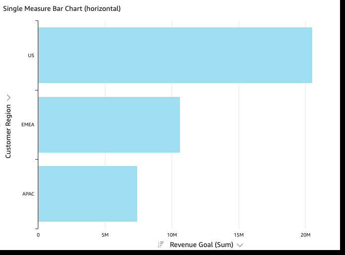
Single-measure – A single-measure bar chart shows values for a single measure for a dimension. For example, the revenue goal per region, as shown in the following image.
-
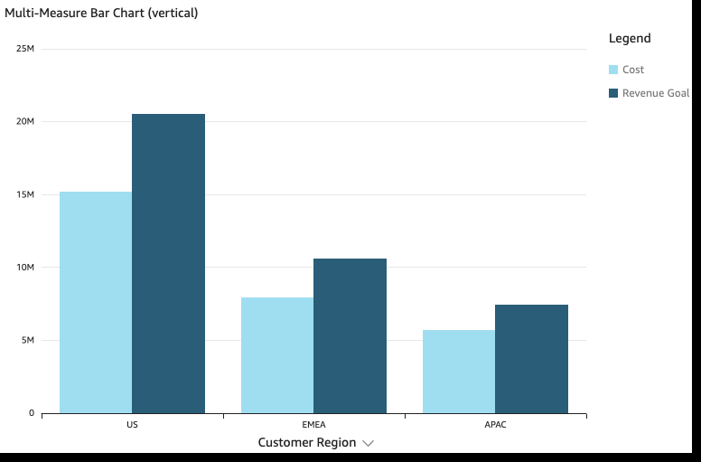
Multi-measure – A multi-measure bar chart shows values for multiple measure for a dimension. For example, the revenue goal and cost per region, as shown in the following image.
-
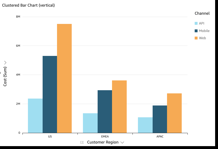
Clustered – A clustered bar chart shows values for a single measure for a dimension, grouped by another dimension. For example, the cost for each channel in a region, as shown in the following image.
-
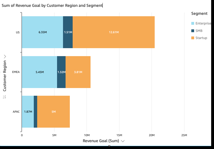
Stacked – A stacked bar chart is similar to a clustered bar chart in that it displays a measure for two dimensions. However, instead of clustering bars for each child dimension by the parent dimension, it displays one bar per parent dimension. It uses color blocks within the bars to show the relative values of each item in the child dimension. The color blocks reflect the value of each item in the child dimension relative to the total for the measure. A stacked bar chart uses a scale based on the maximum value for the selected measure. For example, the revenue goal for each segment by region, as shown in the following image.
-
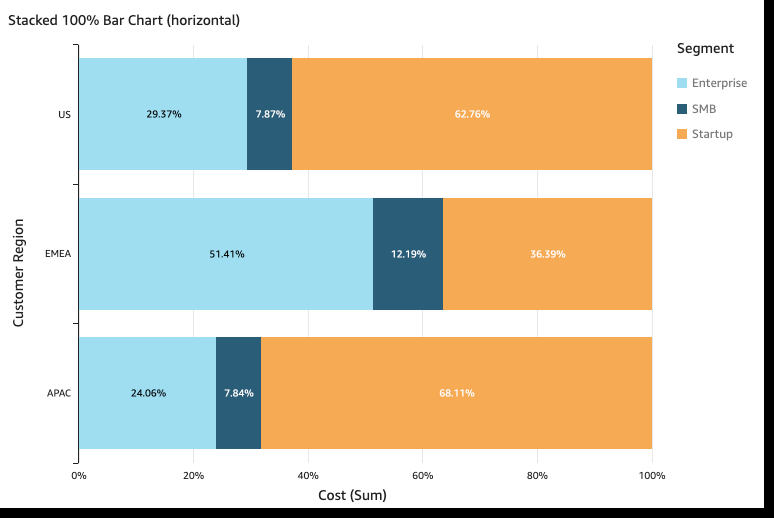
Stacked 100 percent – A stacked 100 percent bar chart is similar to a stacked bar chart. However, in a stacked 100 percent bar chart, the color blocks reflect the percentage of each item in the child dimension, out of 100 percent. For example, the percent each segment costs per region, as shown in the following image.
Bar charts show up to 2,500 data points on the axis for visuals that don't use group or color. For visuals that do use group or color, they show up to 50 data points on the axis and up to 50 data points for group or color. For more information about how Insights handles data that falls outside display limits, see the “Display limits” section in Visual types in Insights.
Procedures
Create a single-measure bar chart
- Click Visualize (the bar chart icon in the tool bar). The Visuals panel opens.
- Click Add.
-
Click the Horizontal bar chart or Vertical bar chart icon.

- Drag a dimension from the Data panel into the X Axis or Y Axis field well.
- Drag a measure from the Data panel into the Value field well.
Create a multi-measure bar chart
- Click Visualize (the bar chart icon in the tool bar). The Visuals panel opens.
- Click Add.
-
Click the Horizontal bar chart or Vertical bar chart icon.
- Drag a dimension from the Data panel into the X Axis or Y Axis field well.
- Drag at least two measures from the Data panel into the Value field well.
Create a clustered bar chart
- Click Visualize (the bar chart icon in the tool bar). The Visuals panel opens.
- Click Add.
-
Click the Horizontal bar chart or Vertical bar chart icon.
- Drag a dimension from the Data panel into the X Axis or Y Axis field well.
- Drag a measure from the Data panel into the Value field well.
- Drag a dimension from the Data panel into the Group/Color field well.
- Click Visualize (the bar chart icon in the tool bar). The Visuals panel opens.
- Click Add.
-
Click the Horizontal stacked bar chart or Vertical stacked bar chart icon.

- Drag a dimension from the Data panel into the X Axis or Y Axis field well.
- Drag a measure from the Data panel into the Value field well.
- Drag a dimension from the Data panel into the Group/Color field well.
-
(Optional) Add data labels and show totals:
- Click Format visual (the chart icon in the upper-right corner of the visual). The Properties panel opens.
- Toggle on Data labels. Labels for each measure value appear in the chart.
- Select Show totals. Totals appear for each bar in the chart.
Create a stacked 100 percent bar chart
- Click Visualize (the bar chart icon in the tool bar). The Visuals panel opens.
- Click Add.
-
Click the Horizontal stacked 100% bar chart or Vertical stacked 100% bar chart icon.

- Drag a dimension from the Data panel into the X Axis or Y Axis field well.
- Drag at least two measures from the Data panel into the Value field well.
Bar chart features
The following table lists the actions you can do with bar charts.
| Feature | Supported? | Comments | For more information |
|---|---|---|---|
| Change the legend display | Yes, with exceptions | Multi-measure and clustered bar charts display a legend. Single-measure horizontal bar charts don’t. | Legends on visual types in Insights |
| Change the title display | Yes | Format visual titles and subtitles in Insights | |
| Change the axis range | Yes | Set the range and scale on visuals in Insights | |
| Show or hide axis lines, grid lines, axis labels, and axis sort icons | Yes | Format axes and grid lines on visual types in Insights | |
| Change the visual colors | Yes | Colors in visual types in Insights | |
| Focus on or exclude elements | Yes, with exceptions | You can focus on or exclude any bar on the chart, except when you are using a date field as the dimension for the axis. In that case, you can only focus on a bar, not exclude it. | |
| Sort | Yes | You can sort on the fields you choose for the axis and the values. | Sorting visual data in Insights |
| Perform field aggregation | Yes | You must apply aggregation to the field or fields you choose for the value. You cannot apply aggregation to the fields you choose for the axis or group/color. | Changing field aggregation |
|
Add drill-downs |
Yes |
You can add drill-down levels to the axis and Group/Color field wells. |
|
|
Show data labels |
Yes |
|
|
|
Show stacked bar chart totals |
Yes |
Showing totals in a stacked bar chart is only available when you choose to show data labels. |
Related topics