

Use KPIs
Prerequisites
-
You have the Insights Author license.
Page location
Insights > Analyses > Click an analysis
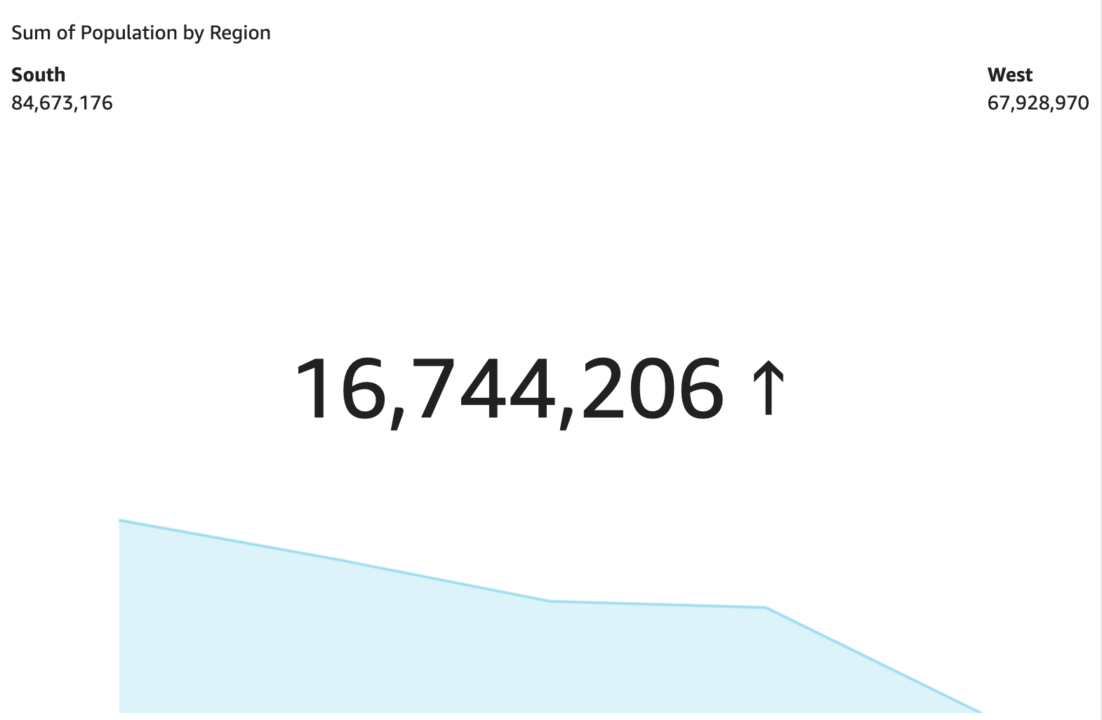
Use a key performance indicator (KPI) to visualize a comparison between a key value and its target value.
A KPI displays a value comparison, the two values being compared, and a visual that provides context to the data that's displayed. You can choose from a set of predesigned layouts to suit your business needs. The following image shows an example of a KPI visual that uses a sparkline.
Procedures
Create a KPI
- Click Visualize (the bar chart icon in the tool bar). The Visuals panel opens.
- Click Add.
-
Click the Key Performance Indicator (KPI) icon.

- Drag a measure from the Data panel into the Value field well.
- Drag a different measure into the Target Value field well.
- (Optional) To format the KPI chart, click Format visual (the bar chart icon in the upper-right corner of the visual) and then use the settings in the Properties panel to customize the chart. For more information on KPI formatting options, see KPI options.
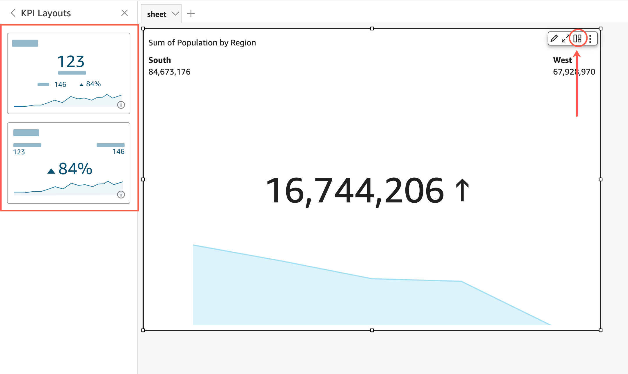
Change the layout of a KPI
- Hover over the visual and click KPI layouts. The KPI Layouts panel opens.
- Click the KPI layout that you want to use.
The following image shows the KPI Layouts menu.
KPI features
The following table lists the actions you can do with KPIs.
| Feature | Supported? | Comments | For more information |
|---|---|---|---|
| Change the title display | Yes | Format visual titles and subtitles in Insights | |
| Remove the title | Yes | You can choose not to display a title. | |
| Change comparison method | Yes | By default, Insights automatically chooses a method. The settings are auto, difference, percent, and difference as percent. | |
| Change the primary value displayed | Yes | You can choose comparison (default) or actual. | |
| Display or remove the progress bar | Yes | You can format the visual to either display (default) or not display a progress bar. |
Related topics