

Use waterfall charts
Prerequisites
-
You have the Insights Author license.
Page location
Insights > Analyses > Click an analysis
Waterfall charts visualize a sequential summation as values are added or subtracted. In a waterfall chart, the initial value goes through a (positive or negative) change, with each change represented as a bar. The last bar represents the final total. Waterfall charts are also known as bridges because the connectors between the bars bridge the bars together, showing that they visually belong to the same story.
Waterfall charts are most commonly used to present financial data because you can show change within one time period or from one time period to another. This way, you can visualize the different factors that impact your project cost.
EXAMPLE You can use a waterfall chart to show gross sales to net income within the same month, or the difference in net income from last year to this year, and the factors that were responsible for this change.
You can also use waterfall charts to present statistical data, for example how many new employees you hired and how many employees left your company within a year.
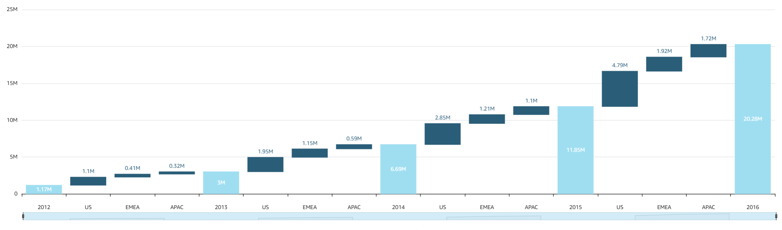
The following screenshot shows a waterfall chart.
Procedure
Create a basic waterfall chart
- Click Visualize (the bar chart icon in the tool bar). The Visuals panel opens.
- Click Add.
-
Click the Waterfall chart icon.

- Drag at least one field from the Data panel into the Category or Value field well.
- (Optional) To add drill-down layers, drag at least one more field into the Category or Value field well. For more information about adding drill-downs, see Adding drill-downs to visual data in Insights.
Related topics