

Use scatter plots
Prerequisites
-
You have the Insights Author license.
Page location
Insights > Analyses > Click an analysis
Use scatter plots to visualize two or three measures across two dimensions.
Each bubble on the scatter plot represents one or two dimension values. The X and Y axes represent two different measures that apply to the dimension. A bubble appears on the chart at the point where the values for the two measures for an item in the dimension intersect. Optionally, you can also use bubble size to represent an additional measure.
Scatter plots show up to 2500 datapoints in aggregated and unaggregated scenarios regardless of whether a color or label dimension is used in the visual. For more information about how Insights handles data that falls outside display limits, see the “Display limits” section in Visual types in Insights.
Procedure
Create a scatter plot
- Click Visualize (the bar chart icon in the tool bar). The Visuals panel opens.
- Click Add.
-
Click the Scatter plot icon.

- Drag a measure from the Data panel into the X Axis field well.
- Drag a measure into the Y Axis field well.
- (Optional) Drag a dimension into the Color field well.
- (Optional) Drag a dimension into the Label field well.
- (Optional) Drag a measure into the Size field well.
- (Optional) To add drill-down layers, drag at least one more dimension into the Color field well. For more information about adding drill-downs, see Adding drill-downs to visual data in Insights.
Scatter plot features
The following table lists the actions you can do with scatter plots.
| Feature | Supported? | Comments | For more information |
|---|---|---|---|
| Change the legend display | Yes, with exceptions | Scatter plots display a legend if you have the Color field well populated. | Legends on visual types in Insights |
| Change the title display | Yes | Format visual titles and subtitles in Insights | |
| Change the axis range | Yes | You can set the range for both the X and Y axes. | Set the range and scale on visuals in Insights |
| Show or hide axis lines, grid lines, axis labels, and axis sort icons | Yes | Format axes and grid lines on visual types in Insights | |
| Change the visual colors | Yes | Colors in visual types in Insights | |
| Focus on or exclude elements | Yes, with exceptions | You can focus on or exclude a bubble in a scatter plot, except when you are using a date field as a dimension. In that case, you can only focus on a bubble, not exclude it. | |
| Sort | No | Sorting visual data in Insights | |
| Perform field aggregation | Yes | You must apply aggregation to the fields you choose for the X axis, Y axis, and size. You cannot apply aggregation to the field that you choose for the group or color. | Changing field aggregation |
| Display unaggregated fields | Yes | To display unaggregated X and Y axis values, click the three dots next to the field and select Aggregate > None. If your scatter plot shows unaggregated fields, you can't apply aggregations to the field that is in the Color or Label field well. Scatter plots do not support mixed aggregation. | |
| Add drill-downs | Yes | You can add drill-down levels to the Color field well. | Adding drill-downs to visual data in Insights |
Scatter plot use cases
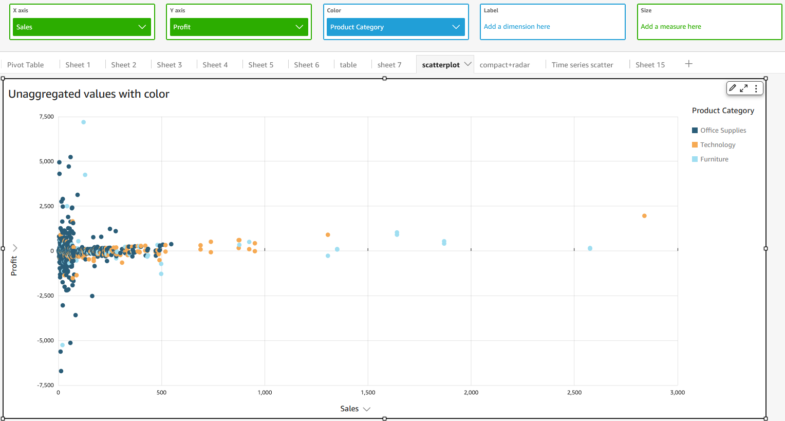
To plot unaggregated values even if you have data in the Color field well, use the aggregate option None on the field menu, which also contains aggregation options like Sum, Min, and Max. If one value is set to be aggregated, the other value will be automatically set as aggregated. The same applies to unaggregated scenarios. Mixed aggregation scenarios are not supported, meaning that one value cannot be set as aggregated while the other is unaggregated.
NOTE The unaggregated scenario, which is the None option, is supported only for numerical values, while categorical values, such as dates or dimensions, will display only aggregate values, such as Count and Count distinct.
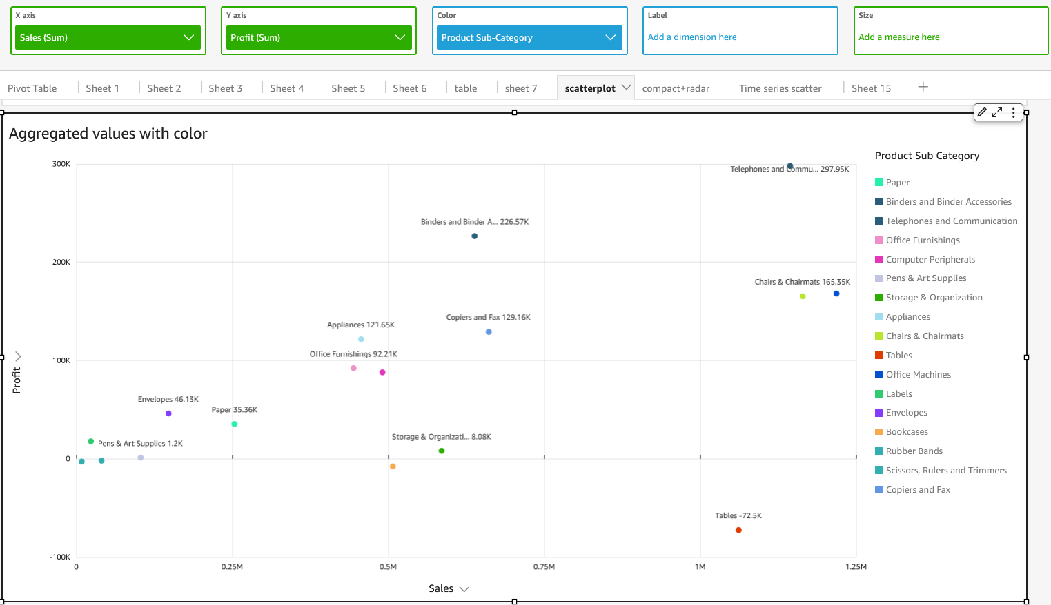
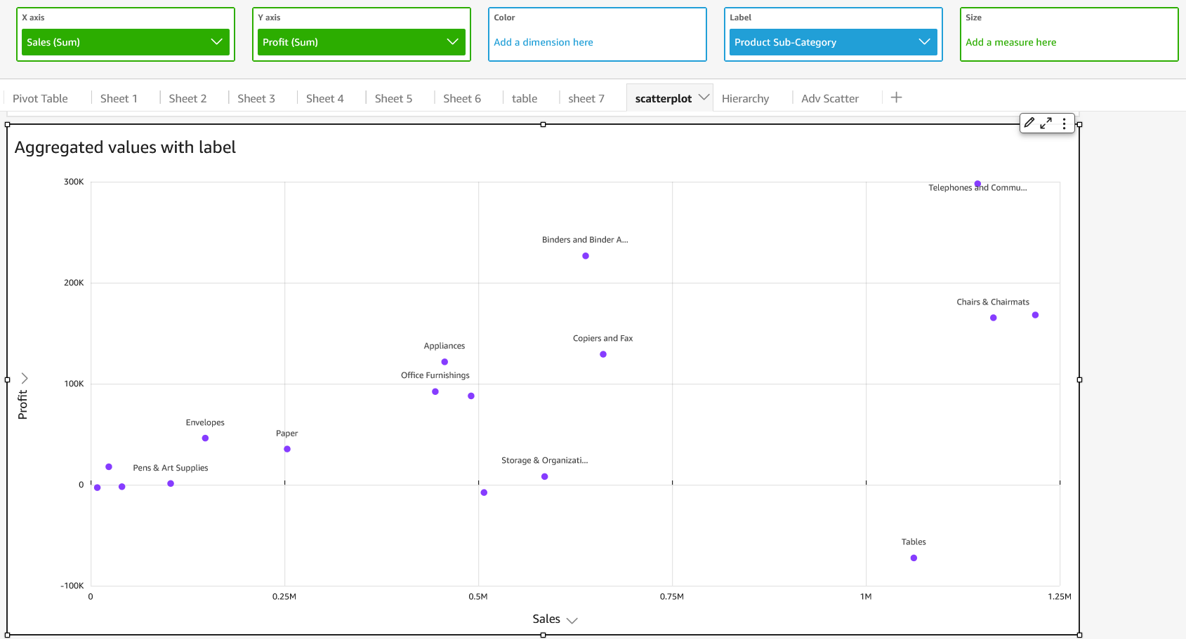
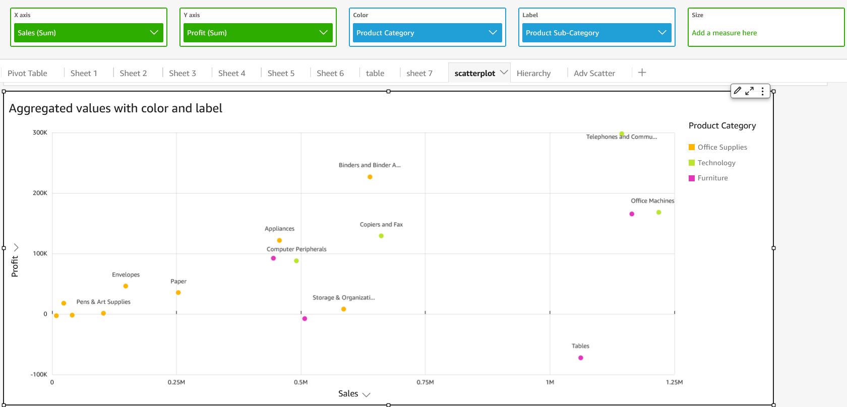
Using the none option, you can choose to set both X and Y values to either aggregated or unaggregated from the X Axis and Y Axis field menus. This will define whether or not values will be aggregated by dimensions in the Color and Label field wells. To get started, add the required fields and choose the appropriate aggregation based on your use case,as shown in the following sections.
Unaggregated use cases
-
Unaggregated X and Y values with Color
-
Unaggregated X and Y values with Label

-
Unaggregated X and Y values with Color and Label

Aggregated use cases
-
Aggregated X and Y values with Color
-
Aggregated X and Y values with Label
-
Aggregated X and Y values with Color and Label
Related topics