

Use line charts
Prerequisites
-
You have the Insights Author license.
Page location
Insights > Analyses > Click an analysis
Use line charts to compare changes in measure values over period of time for the following scenarios:
-
One measure over a period of time
EXAMPLE Gross sales by month
-
Multiple measures over a period of time
EXAMPLE Gross sales and net sales by month
-
One measure for a dimension over a period of time
EXAMPLE Number of flight delays per day by airline
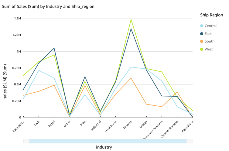
Line charts show the individual values of a set of measures or dimensions against the range displayed by the Y axis. The following screenshot shows a line chart.
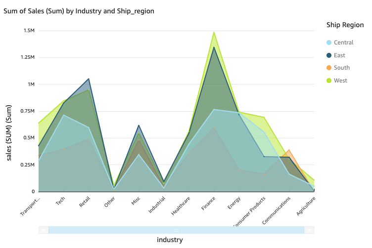
Area line charts differ from regular line charts in that each value is represented by a colored area of the chart instead of just a line to make it easier to evaluate item values relative to each other. The following screenshot shows an area line chart. In this version of a line chart, the area between the line and the x-axis is filled with color.
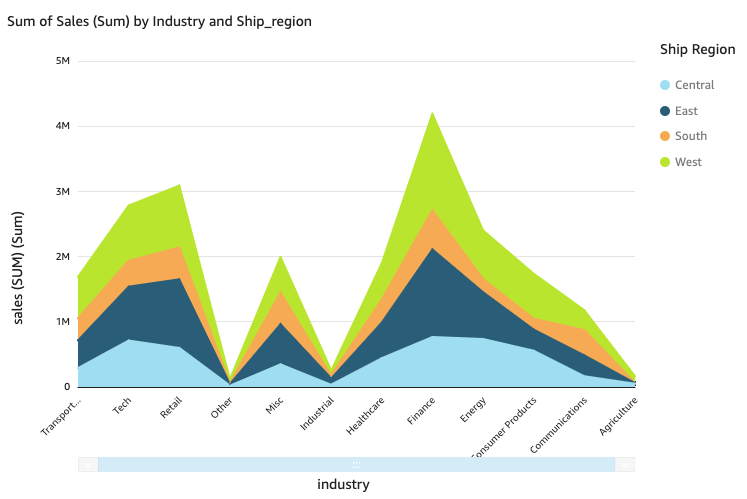
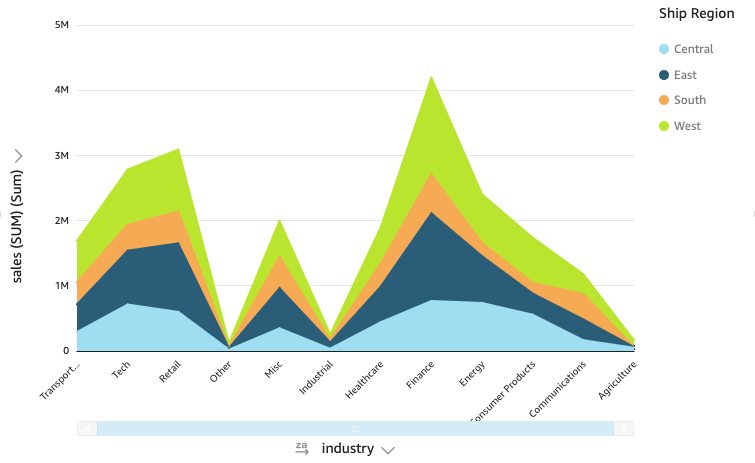
The following screenshot shows a stacked area line chart. Use stacked area line charts to compare changes in values for one or more groups of measures or dimensions over a period of time. In this version of a line chart, the area between the line and the X axis is filled with color. Also, the individual lines are layered to more clearly show the relationships between them. The values on the y-axis show the scale of the differences between data points.
Line charts show up to 10,000 data points on the x-axis when no color field is selected. When color is populated, line charts show up to 400 data points on the x-axis and up to 25 data points for color. For more information about data that falls outside the display limit for this visual type, see the “Display limits” section in Visual types in Insights.
Procedures
View the values on a line chart
Each line on the chart represents a measure value over a period of time.
- Hover over any line (1 in the screenshot) to see a pop-up legend that shows the values for each line on the X axis.
- If you hover over a data point (2), you can see the Value for that specific point on the X axis.

- Click Visualize (the bar chart icon in the tool bar). The Visuals panel opens.
- Click Add.
-
Click the Line chart, Area line chart, or Stacked area line chart icon.
- Drag a dimension from the Data panel into the X Axis field well.
- Drag a measure into the Value field well. With steps 4 and 5, you create a single-measure line chart.
- (Optional) To create a multi-measure line chart, drag at least one more measure into the Value field well.
- (Optional) To create a multi-dimension line chart, drag a dimension into the Color field well.
- (Optional) To add drill-down layers, at least one more field into the X axis or Color field wells. For more information about adding drill-downs, see Adding drill-downs to visual data in Insights.
If you have two or more metrics that you want to display in the same line chart, you can create a dual-axis line chart. A dual-axis chart is a chart with two Y-axes (one axis at the left of the chart, and one axis at the right of the chart).
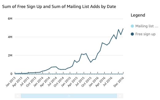
You create a line chart that shows the number of visitors who signed up for a mailing list and for a free service over a period of time. If the scale between those two measures varies widely over time, your chart might look something like the following line chart. Because the scale between measures varies so greatly, the measure with the smaller scale appears nearly flat at zero.
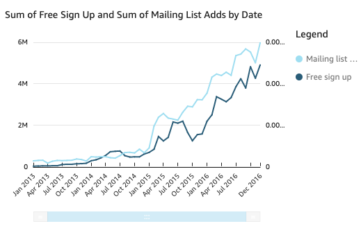
To show these measures in the same chart, you create a dual-axis line chart. The following is an example of the same line chart with two Y-axes. Both lines are now visible.
-
In your analysis, create a line chart. For instructions, see Create a line chart.
-
In the Value field well, click the three vertical dots and select Show on: Right Y-axis.
You can also create a dual-axis line chart using the Properties pane:
-
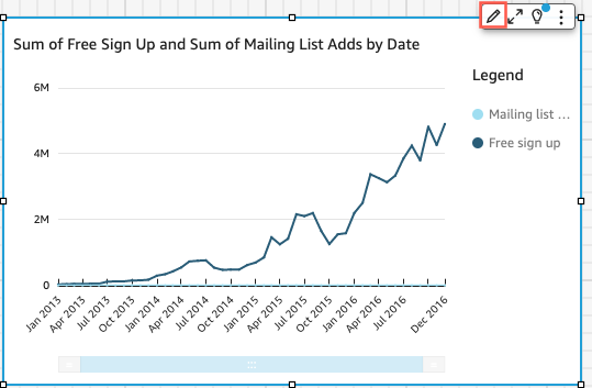
On the menu in the upper-right corner of the line chart, click Format visual. The Properties panel opens.
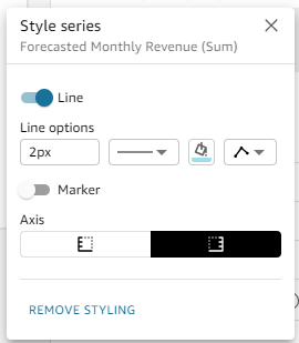
- Expand Data series.
- Click the value that you want to place on a separate axis. Click Select Series to Style to quickly find a value if you need to. The Style series window opens.
-
Click the Axis icon.
The chart updates with two axes.
For more information about formatting axis lines, see Format axes and grid lines on visual types in Insights. For more information about adjusting the range and scale of an axis, see Set the range and scale on visuals in Insights.
Simplify a stacked area line chart
Because a stacked area line chart works differently than other line charts, simplify it if you can. Then the audience won't try to interpret the numbers. Instead, they can focus on the relationships of each set of values to the whole. One way to simplify is to remove the numbers down the left side of the screen by reducing the step size for the axis.
- Hover over the line chart and click Format visual. The Properties panel opens.
- Expand Y-axis.
- Select Step size.
- Enter 2. The following screenshot shows the result.
Line chart features
The following table lists the actions you can do with line charts.
| Feature | Supported? | Comments | For more information |
|---|---|---|---|
| Change the legend display | Yes | Legends on visual types in Insights | |
| Change the title display | Yes | Format visual titles and subtitles in Insights | |
| Change the axis range | Yes | You can set the range for the Y axis. | Set the range and scale on visuals in Insights |
| Show or hide axis lines, grid lines, axis labels, and axis sort icons | Yes | Format axes and grid lines on visual types in Insights | |
| Add a second Y-axis | Yes | Create a dual-axis line chart | |
| Change the visual colors | Yes | Colors in visual types in Insights | |
| Focus on or exclude elements | Yes, with exceptions |
You can focus on or exclude any line on the chart, except in the following cases:
In these cases, you can only focus on a line, not exclude it. |
|
| Sort | Yes, with exceptions | You can sort data for numeric measures in the X axis and Value field wells. Other data is automatically sorted in ascending order. | Sorting visual data in Insights |
| Perform field aggregation | Yes | You must apply aggregation to the field that you choose for the value. You cannot apply aggregation to the fields you choose for the X axis and color. | Changing field aggregation |
| Add drill-downs | Yes | You can add drill-down levels to the X axis and Color field wells. | Adding drill-downs to visual data in Insights |
Related topics