

Use Sankey diagrams
Use Sankey diagrams to show flows from one category to another, or paths from one stage to the next.
For example, a Sankey diagram can show the number of people migrating from one country to another. A Sankey diagram can also show the path a web visitor takes from one page to the next on a company website, with possible stops along the way.
Prerequisites
-
You have the Insights Author license.
- You are using a dataset that contains a measure and two dimensions. One of these dimensions contains source categories, and the other contains destination categories.
Page location
Insights > Analyses > Click an analysis
Data for Sankey diagrams
The following table is a simple example of data for a Sankey diagram.
| Dimension (Source) | Dimension (Destination) | Measure (Weight) |
|---|---|---|
| A | W | 500 |
| A | X | 23 |
| A | Y | 147 |
The following Sankey diagram is created when the dimensions and measure are added to the field well, with the A node on the left linking to the W, Y, and X nodes on the right. The width of each link between nodes is determined by the value in the Measure (Weight) column. The nodes are automatically ordered.

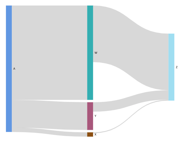
To create multilevel Sankey diagrams in Insights, your dataset should still contain a measure and two dimensions (one for source and one for destination), but in this case your data values differ.
The following table is a simple example of data for a multilevel Sankey diagram with two stages.
| Dimension (Source) | Dimension (Destination) | Measure (Weight) |
|---|---|---|
| A | W | 500 |
| A | X | 23 |
| A | Y | 147 |
|
W |
Z |
300 |
|
X |
Z |
5 |
|
Y |
Z |
50 |
The following Sankey diagram is created when the dimensions and measure are added to the field well. Here, the A node on the left links to the W, Y, and X nodes in the middle, and the W, Y, and X nodes then link to the Z node on the right. The width of each link between nodes is determined by the value in the Measure (Weight) column.
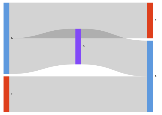
Working with cyclical data
Sometimes, the data that you use for a Sankey diagram contains cycles. For example, suppose that you're visualizing user traffic flows between pages on a website. You might discover that users who come to page A move to page E and then come back to page A. An entire flow might look something like A-E-A-B-A-E-A.
When your data contains cycles, the nodes in each cycle are repeated in Insights. For example, if your data contains the flow A-E-A-B-A-E-A, the following Sankey diagram is created.
Procedures
Create a Sankey diagram
- Click Visualize (the bar chart icon in the tool bar). The Visuals panel opens.
- Click Add.
-
Click the Sankey diagram icon.

- Drag a dimension from the Data panel into the Source field well.
- Drag a dimension into the Destination field.
- Drag a measure into the Weight field.
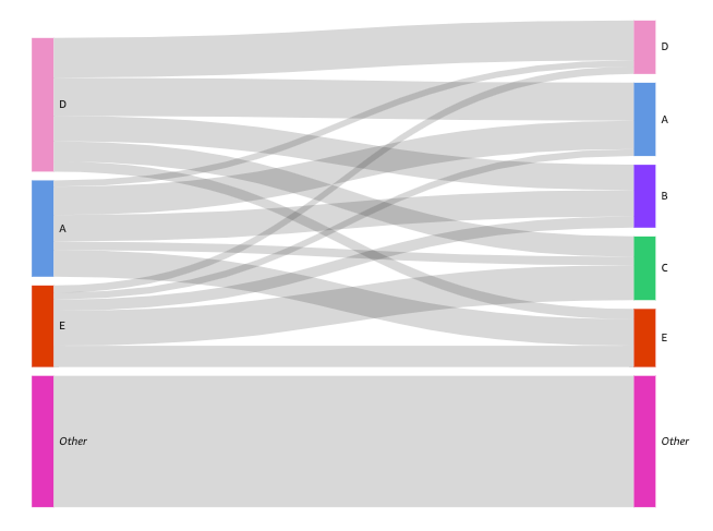
Customize the number of nodes that appear in a Sankey diagram
Insights supports up to 100 Source/Destination nodes.
- Hover over the visual and click Format visual. The Properties panel opens.
- Expand Source or Destination.
-
Enter a number in the Number of nodes displayed field. The nodes in the diagram update to the number that you specified. The top nodes are automatically shown. All other nodes are placed in an Other category.
NOTE Specifying the number of Source nodes controls how many Source nodes can appear overall in the diagram. Specifying the number of Destination nodes controls how many Destination nodes can appear per Source node. This means that if there is more than one Source node in your diagram, the overall number of Destination nodes will be higher than the number specified.
EXAMPLEThe following Sankey diagram has a limit of three source nodes (out of five), so the top three are shown in the diagram. The other two source nodes are placed in the Other category.
Remove the Other category from the diagram
- Click the Other category and select Hide “other” categories.
Sankey diagram features
The following table lists the actions you can do with Sankey diagrams.
| Feature | Supported? | For more information |
|---|---|---|
| Change the legend display | No | |
| Change the title display | Yes | Format visual titles and subtitles in Insights |
| Change the axis range | No | |
| Change the visual colors | No | |
| Focus on or exclude elements | Yes | |
| Sort | No | |
| Perform field aggregation | Yes | Changing field aggregation |
| Add drill-downs | No | |
| Conditional formatting | No |
Related topics