

Advanced: Add an up- or down-pointing arrow to show change over time
Sure, numbers are great, but sometimes you just need to see if a number is going up or down. In this example, a picture is worth a thousand words, so here’s the finished product:
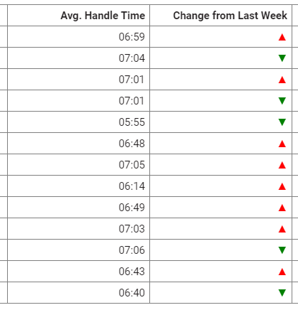
Here, the arrows show how each agent’s average handle time this week is different from their handle time last week. Having a lower handle time this week than last week is good, so the down-pointing arrows are green, and the up-pointng arrows are red.
For this example, we will create a custom measure. Just like it sounds, a custom measure is based on one of Data Explorer’s standard measures but then customized.
Before you can create a custom measure, you need to know:
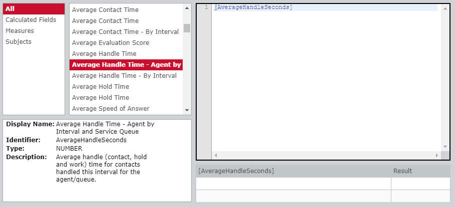
- Which standard measure you’ll be customizing. In our example, the standard measure is “Average Handle Time - Agent by Interval and Service Queue.”
- The time period that you want to compare. In our example, we want to compare last week’s number of contacts to this week’s number of contacts, so our time period is “week.”
PREREQUISITE The arrows come from the character map on your computer. How to get to this map will vary based on your computer, but try searching for “character map” in your computer’s search field. When we enter the arrows in the Content Attributes field in step 6, copy each arrow from the map.
-
In the Question panel, under What, click [measure]. The Select Measure window opens.
NOTE There’s a lot going on in this window, and it might not open big enough for you to see everything. Don’t be shy about making it bigger or resizing the panels if you need to.
- Click Custom (upper right corner).
- Enter a name for the new measure in the Name field. (Ours is “Change from Last Week.”)
-
Double-click the standard measure from the second column. Information about the standard measure appears below the columns, and the measure appears in the Formula pane.

NOTE Sometimes a measure’s display name (what it’s called in a report) is different from its identifier (what it’s called behind the scenes). In the example above, the display name is “Average Handle Time - Agent by Interval and Service Queue,” and the identifier is “AverageHandleSeconds.”
-
Enter a formula in the Formula field that follows this pattern: [AverageHandleSeconds]-timeShiftValue([AverageHandleSeconds], [Interval Start], “Week”, -1)
NOTE The [brackets] here are literal brackets that you type, not a placeholder for something else. “AverageHandleSeconds” is our measure identifier, and “Week” is the time period.
-
In the Content Attributes field, enter <RANGE :0- <REPLACE “▼”;FORECOLOR green>; RANGE 0:0 <REPLACE “▬”;FORECOLOR yellow>; RANGE 0+: REPLACE “▲”;FORECOLOR red>>
This formula tells Data Explorer to show a green down-pointing arrow for numbers under zero, a yellow dash for zero, and a red up-pointing arrow for numbers above zero.
- Click Apply. The Measure window closes, and the colored arrows appear in your report. Pretty neat, huh?
- Click Save.
Want more content attributes?
We’re biased, but we think content attributes are pretty neat, and there are a lot more of them than what we’ve covered here. A full list of all content attributes and how to use them is here: About content attributes.
Keep learning about Data Explorer
Our Data Explorer library has a great collection of guides for people who are new to Data Explorer or are looking to grow their skills. Check them out!
For beginners
- Beginner’s Guide to Data Explorer Dashboards—An intro to the basics of dashboards
- Beginner’s Guide to Data Explorer Reports—An intro to the basics of reports
For QM
- Data Explorer Quick Start Guide: Build a QM Evaluation Report—Step-by-step guide to building a report on evaluation scores
- Data Explorer Quick Start Guide: Monitor Today’s Contact Volumes and Recordings—Build reports that help you keep track of contacts coming in today
- Data Explorer Quick Start Guide: Build a Report on Call Recording Events—Step-by-step guide to building a report on hold, pause, silence, and talk over events
For Analytics
- Data Explorer Quick Start Guide: Build a Report on Phrase Hits—Create a report on hits from a specific phrase category for the past six months
- Data Explorer Quick Start Guide: Build a Report on Analytics Phrase Hits by Agent—Create a report on phrase hits from the past week, broken down by agent
For intermediate users
- Data Explorer Quick Start Guide: Filter Reports on Your Dashboard—Reduce the list of reports you need to wade through by adding interactive filters
- Data Explorer Quick Start Guide: Customize a Report’s Appearance—Make your reports more useful by changing how they look
- Data Explorer Quick Start Guide: Create a Drill-Through Dashboard—Start with the big picture and dig into the details