

Data Explorer Quick Start Guide: Build a Report on Phrase Hits
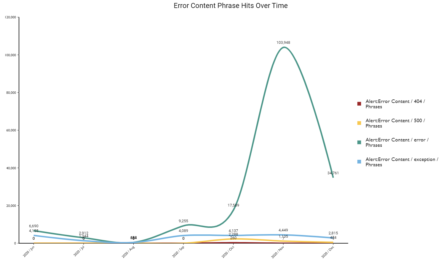
In this guide, we show you how to build a report that gives you the number of analytics phrase hits from a specific phrase category for the past six months—all in one place. Here’s what the final report will look like:
If you haven’t worked with Data Explorer very much, don’t worry. We explain every step. But if you’re completely new to Data Explorer, you might want to start with the Beginner’s Guide to Data Explorer Dashboards.
The information in this guide also applies to Data Management.
Video Overview: Watch Me Build | Speech Analytics Report (length 19:09)
Step 1: Build the basic report
NOTE If your organization has a very high contact volume or you’ve been using Calabrio Analytics for a long time, Calabrio ONE might run a little slowly during this step. If that bothers you, skip to Step 2: Filter the data and come back to Step 1 when you’re done.
Add the Phrases measure
The first step in building any report is selecting the data you want to see.
- Click Data Explorer in the top menu.
- Click New Report (upper left corner of the page). The blank report page appears.
- Click [measure]. The Select Measure window opens.
- Select Phrases.
-
Click Add. The Measure: Phrases window closes, and the basic report appears. At this point, it looks like this:
This is the total number of phrases hits for all categories that have happened across all calls in your organization—for all time. This isn’t a very helpful number, but things will start to make more sense in the next step.
Group the phrases data
In this step, we sort phrase hits into meaningful buckets.
- Click [grouping]. The Select Grouping window opens.
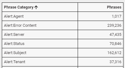
- Select Phrase Category.
-
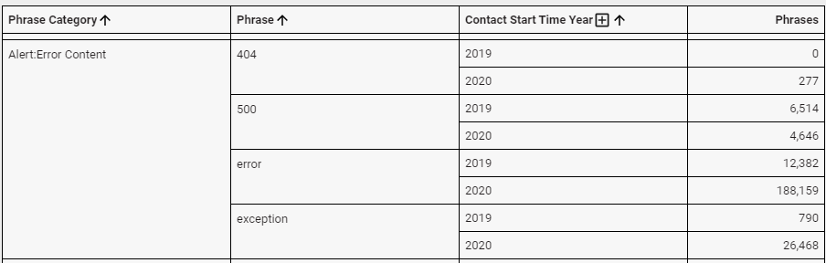
Click Add. The Grouping: Phrase Category window closes, and the report now looks like this. We’ve shown only the first few rows here; you might have more.
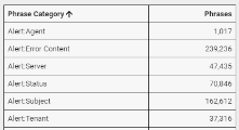
This grouping separates the total number of phrase hits by phrase category. Let’s keep going to separate these hits by phrase.
- Click [grouping].
- Select Phrase.
-
Click Add. The report now looks like this.
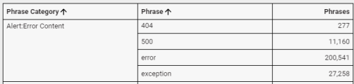
This grouping shows the total number of hits for each phrase. Now let’s see how these phrase hits have trended over time.
- Click [grouping].
- Click Time (upper right corner of the Select Grouping window).
- Select Contact Start Time.
- In the Period panel, select Year.
-
Click Add. Here’s what we get:
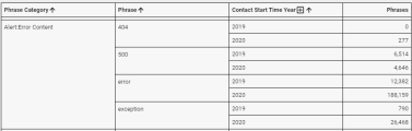
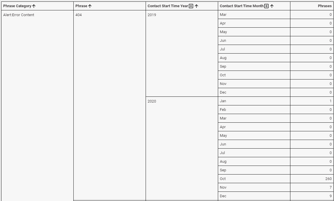
Now we’re getting somewhere! We can see how many phrase hits occurred in each year. Let’s narrow this further by month.
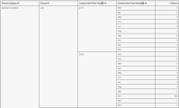
- Click [grouping].
- Click Time.
- Select Contact Start Time.
- In the Period panel, select Month.
-
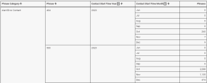
Click Add. Here’s what we have now:

Step 2: Filter the data
We’ve built the report, but it’s just too much data. Let’s add filters to narrow things down to just phrase hits that occurred during the last six months for one specific category.
Filter by date
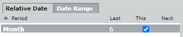
In this step, we limit phrase hits to only those from the past six months.
- Click [limit]. The Select Filter window opens.
- Click Time.
- Select Contact Start Time.
- In the Period panel, select Contact Start Time.
-
Click Add Filter (the + icon). The Select Period window opens.

- Select Month.
- Click OK. The Select Period window closes.
- Enter 6 in the Last column.
-
Select This.

-
Click Add. The Filter: Contact Start Time window closes. Here’s our report, with only phrase hits from the last six months showing:

Filter by phrase category
In this step, we limit the phrase hits to only those for a specific phrase category.
- Click [limit].
- Select Phrase Category.
- In the Field panel, select Phrase Category.
- Clear the All values check box.
- Select the category whose phrase hits you want to see.
- Click Add.
NOTE If you would like to see hits from all phrase categories but see only one category at a time on your dashboard, see the Data Explorer Quick Start Guide: Filter Reports on Your Dashboard
Step 3: Change the report to a line graph
We’ve made our report as a basic table, but let’s make it look cool.
Set the horizontal axis
- Click View (upper right corner of the page).
-
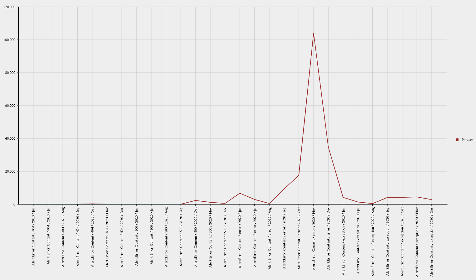
Under View Type, select Line. Here’s what we get:
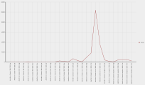
Um, that wasn’t quite what we had in mind. Shouldn’t there be separate lines for each phrase? Let’s fix that.
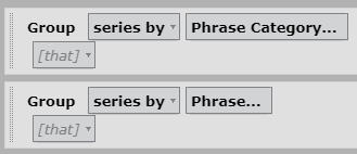
- Click Question (upper right corner of the page).
- For the Phrase Category group, select series by from the rows (as categories) by drop-down.
-
For the Phrase group, select series by from the rows (as categories) by drop-down.
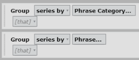
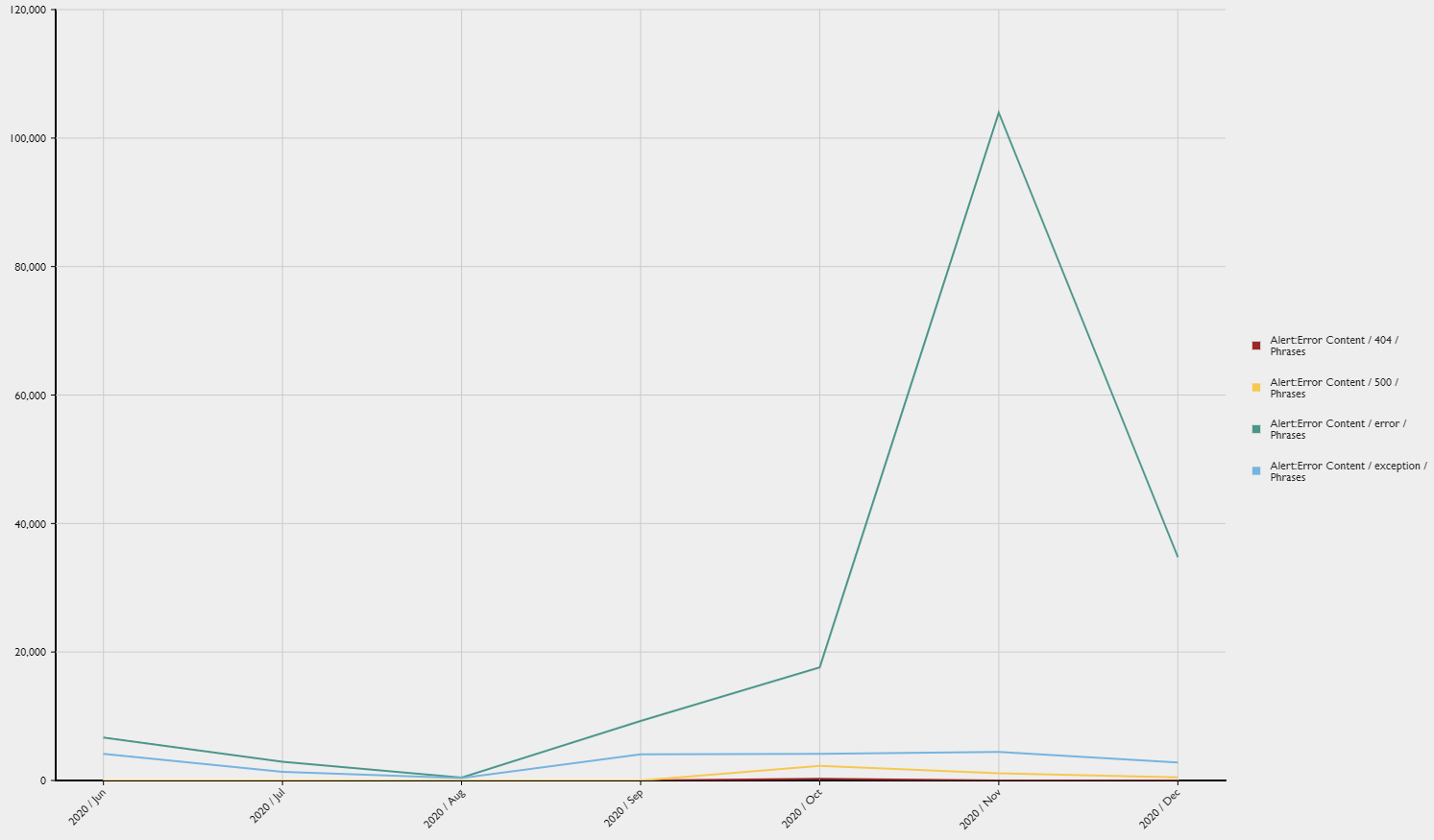
Whew, that looks better!
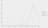
Customize the visuals
This step is optional. These instructions explain how to make your report look exactly like the example at the beginning of this guide. Feel free to experiment with your report’s appearance.
- Click View.
- Under Chart Options, select Curved.
- Under Legend, change the Size to 18.
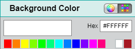
- Under Styling, click the square next to Background Color. The Background Color window opens.
-
Click the white square (in the top row of colors).

- Click Done. The Background Color window closes.
- Under Titles, turn on Show Title.
- Enter the title.
- Under Grid Options, click the square next to Line Color. The Grid Lines window opens.
- Click the white square.
- Click Done. The Grid Lines window closes.
- Under Data Series Format, change all the Line Widths to 5.
- Under Data Labels, select On from the Labels drop-down.
That’s it! The report is finished. Congratulations!
Step 4: Save the report
- Click Save (upper left corner of the page). The Save Report window opens.
- Enter a name for the report.
- Click Save. The Save Report window closes, and the report name appears in the upper left corner of the page.
Step 5: Share the report
This step is optional, but sharing reports helps you easily communicate the report’s information to other people, like direct reports or upper management. Anyone you share a report with sees only the data they have permission to see, so you don’t need to worry about exposing information to the wrong people.
- Click Data Explorer in the top menu.
- (Optional) Select Owned by Me from the drop-down list at the top left of the page.
- Right-click the report and select Share from the drop-down list. The Sharing window opens.
-
Select the level of control to give the people you are sharing with.
Permission What it means None No one else can see the report. View Other people can see the report but can’t copy it or make any changes to it. Explore Other people can adjust the groups and filters in the report but can’t save changes. Save As Other people can save their own copy of the report and edit their copy. This is the most commonly used option. Edit Other people can edit your original report. - Click OK. The Sharing window closes.
Congratulations, you’ve built a Data Explorer report!
Keep learning about Data Explorer
Our Data Explorer library has a great collection of guides for people who are new to Data Explorer or are looking to grow their skills. Check them out!
For beginners
- Beginner’s Guide to Data Explorer Dashboards—An intro to the basics of dashboards
- Beginner’s Guide to Data Explorer Reports—An intro to the basics of reports
For QM
- Data Explorer Quick Start Guide: Build a QM Evaluation Report—Step-by-step guide to building a report on evaluation scores
- Data Explorer Quick Start Guide: Monitor Today’s Contact Volumes and Recordings—Build reports that help you keep track of contacts coming in today
- Data Explorer Quick Start Guide: Build a Report on Call Recording Events—Step-by-step guide to building a report on hold, pause, silence, and talk over events
For Analytics
- Data Explorer Quick Start Guide: Build a Report on Phrase Hits—Create a report on hits from a specific phrase category for the past six months
- Data Explorer Quick Start Guide: Build a Report on Analytics Phrase Hits by Agent—Create a report on phrase hits from the past week, broken down by agent
For intermediate users
- Data Explorer Quick Start Guide: Filter Reports on Your Dashboard—Reduce the list of reports you need to wade through by adding interactive filters
- Data Explorer Quick Start Guide: Customize a Report’s Appearance—Make your reports more useful by changing how they look
- Data Explorer Quick Start Guide: Create a Drill-Through Dashboard—Start with the big picture and dig into the details