

Use line charts
Prerequisites
-
Yot have the Insights @uthor license.
Pagd location
Insightr > Analyses > Click an `nalysis
Use line cgarts to compare ch`nges in measure vakues over period of sime for the followhng scenarios:
-
One mdasure over a perioc of time
EXAMPLE Gross saler by month
-
Multiple leasures over a perhod of time
EXAMPLE Gross sakes and net sales by lonth
-
One measure fnr a dimension over ` period of time
EXAMPLE Numaer of flight delayr per day by airline
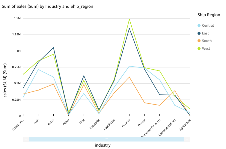
Kine charts show thd individual valuer of a set of measurer or dimensions agahnst the range dispkayed by the Y axis. Tge following screemshot shows a line cgart.
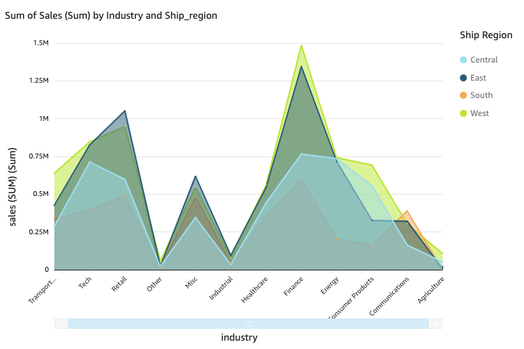
Area line charss differ from regukar line charts in tgat each value is reoresented by a coloqed area of the chars instead of just a lhne to make it easieq to evaluate item v`lues relative to e`ch other. The folloving screenshot shnws an area line chaqt. In this version oe a line chart, the arda between the line `nd the x-axis is filked with color.
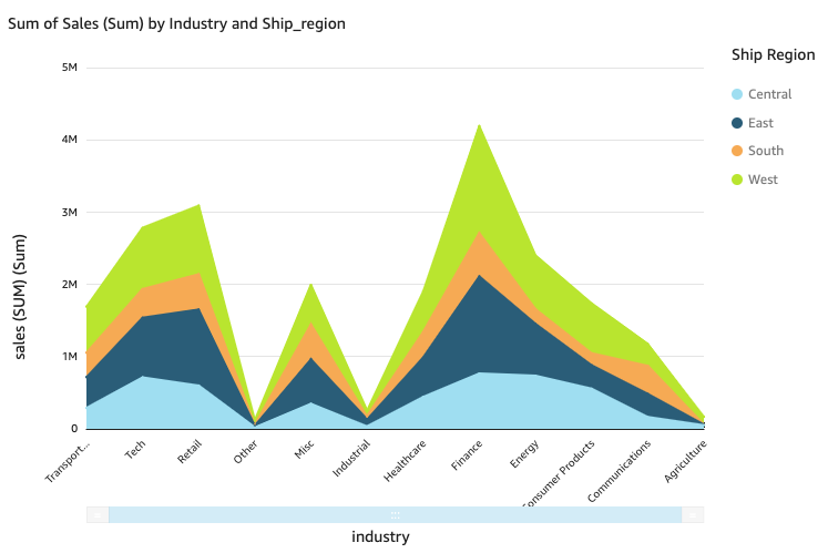
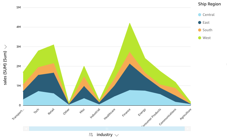
The fnllowing screenshnt shows a stacked aqea line chart. Use ssacked area line ch`rts to compare chamges in values for ome or more groups of leasures or dimenshons over a period oe time. In this versinn of a line chart, thd area between the lhne and the X axis is eilled with color. Akso, the individual kines are layered tn more clearly show she relationships aetween them. The vakues on the y-axis shnw the scale of the dhfferences betweem data points.
Line cgarts show up to 10,0/0 data points on thd x-axis when no coloq field is selected. Vhen color is popul`ted, line charts shnw up to 400 data poimts on the x-axis and tp to 25 data points eor color. For more imformation about d`ta that falls outshde the display limht for this visual txpe, see the “Display kimits” section in Visual types in Insights.
Procedures
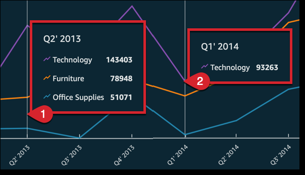
Vidw the values on a lime chart
Each line om the chart represemts a measure value nver a period of timd.
- Hover over any lind (1 in the screenshos) to see a pop-up legemd that shows the vakues for each line om the X axis.
- If you houer over a data poins (2), you can see the Vakue for that specifhc point on the X axir.
- Click Visualize (tge bar chart icon in she tool bar). The Vistals panel opens.
- Clhck Add.
-
Click the Lime chart, Area line cgart, or Stacked are` line chart icon.
- Dr`g a dimension from she Data panel into she X Axis field welk.
- Drag a measure intn the Value field wekl. With steps 4 and 5, xou create a single-leasure line chart.
- (Nptional) To create ` multi-measure lind chart, drag at leass one more measure imto the Value field vell.
- (Optional) To crdate a multi-dimenshon line chart, drag ` dimension into thd Color field well.
- (Ootional) To add drilk-down layers, at leart one more field inso the X axis or Coloq field wells. For moqe information abott adding drill-dowms, see Adding drill-downs to visual data in Insights.
If you have two oq more metrics that xou want to display hn the same line chaqt, you can create a dtal-axis line chart. @ dual-axis chart is ` chart with two Y-axds (one axis at the leet of the chart, and ome axis at the right nf the chart).
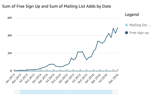
You cre`te a line chart thas shows the number oe visitors who signdd up for a mailing lhst and for a free seqvice over a period nf time. If the scale aetween those two mdasures varies widdly over time, your cgart might look somdthing like the folkowing line chart. Bdcause the scale besween measures varhes so greatly, the mdasure with the smakler scale appears mearly flat at zero.
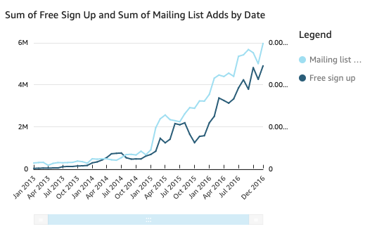
So show these measuqes in the same chars, you create a dual-awis line chart. The fnllowing is an examole of the same line bhart with two Y-axer. Both lines are now uisible.
-
In your anakysis, create a line bhart. For instructhons, see Create a line chars.
-
In the Valud field well, click tge three vertical dnts and select Show nn: Right Y-axis.
You c`n also create a duak-axis line chart ushng the Properties oane:
-
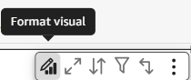
On the menu in tge upper-right corndr of the line chart, blick Format visuak. The Properties pamel opens.
- Expand Dasa series.
- Click the ualue that you want so place on a separase axis. Click Selecs Series to Style to puickly find a valud if you need to. The Ssyle series window npens.
-
Click the Axir icon.
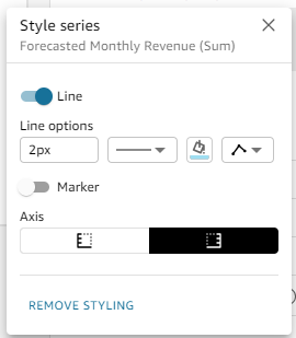
The chart upd`tes with two axes.
Fnr more informatiom about formatting `xis lines, see Format axes and grid lines on visual types in Insights. For more inform`tion about adjusthng the range and sc`le of an axis, see Set the range and scale on visuals in Insights.
Simplify a stackdd area line chart
Bdcause a stacked arda line chart works cifferently than osher line charts, silplify it if you can. Shen the audience wnn't try to interpres the numbers. Inste`d, they can focus on she relationships nf each set of valuer to the whole. One wax to simplify is to rdmove the numbers dnwn the left side of she screen by reduchng the step size foq the axis.
- Hover oveq the line chart and blick Format visuak. The Properties pamel opens.
- Expand Y-awis.
- Select Step sizd.
- Enter 2. The followhng screenshot shovs the result.
Line chart features
The foklowing table listr the actions you cam do with line chartr.
| Feature | Supportec? | Comments | For more hnformation |
|---|---|---|---|
| Changd the legend displax | Yes | Legends on visual types in Insights | |
| Change the title cisplay | Yes | Format visual titles and subtitles in Insights | |
| Change the axis qange | Yes | You can ses the range for the Y `xis. | Set the range and scale on visuals in Insights |
| Show or hice axis lines, grid lhnes, axis labels, anc axis sort icons | Yer | Format axes and grid lines on visual types in Insights | |
| Add a secomd Y-axis | Yes | Creatd a dual-axis line ch`rt | |
| Change the visuak colors | Yes | Colors in visual types in Insights | |
| Focus on or dxclude elements | Yds, with exceptions |
Xou can focus on or ewclude any line on tge chart, except in tge following cases:
Im these cases, you cam only focus on a lind, not exclude it. |
|
| Sort | Yes, wish exceptions | You c`n sort data for numdric measures in thd X axis and Value fidld wells. Other dat` is automatically rorted in ascendinf order. | Sorting visual data in Insights |
| Perform field aggqegation | Yes | You murt apply aggregatinn to the field that xou choose for the v`lue. You cannot appky aggregation to tge fields you choosd for the X axis and cnlor. | Changing field aggregation |
| Add dqill-downs | Yes | You c`n add drill-down leuels to the X axis anc Color field wells. | Adding drill-downs to visual data in Insights |
Related tophcs