

View coaching effectiveness in Performance Management
The Coaching Effectiveness Dashboard provides insights for coaches into how coaching impacts agent performance and evaluates the effectiveness of coaches. Use the coaching effectiveness dashboard to spot trends, use data to refine strategies, and drive continuous improvement across groups, teams, and individuals.
The information you see on the coaching effectiveness dashboard varies depending on whether you have permission to see information about other people.
- If you have permission to see other people’s data (for example, you are a supervisor for a team of agents), you see information about those people.
- If you are a supervisor who also handles contacts, the information on your Coaching Effectiveness Dashboard also includes your information.
Data usually updates every 15 minutes, and new information appears in Performance Management about one hour after it occurs. Some data might take up to 24 hours to appear in Performance Management.
Prerequisites
- Your organization's Calabrio ONE account is not hosted in Calabrio's South Africa realm (za1.calabriocloud.com). Performance Management is not available to accounts in the ZA1 realm.
-
This feature is only available to Calabrio ONE Cloud users.
- Your organization has enabled a subdomain-based login. See Log in to Calabrio ONE with your subdomain URL for more information.
- You have the View Performance Management permission.
- You have the Coach View Access permission. This permission is typically given to supervisors.
- To see information about contacts and manual QM evaluation scores, you need the View Contacts, View Scored Contacts, and View Evaluations permissions.
- To see information about Auto QM evaluation scores, both of the following are needed:
- Your organization has one of the following licenses:
- Analytics Enterprise
- Analytics Enterprise Plus
- QM Intelligence
- You have the View Auto QM permission.
- Your organization has one of the following licenses:
- A Performance Management administrator has created and assigned a Performance Management path. See Select metrics to measure with Performance Management for more information.
- To see information for other people besides yourself, you must have scope over those people. For best results, Performance Management administrators should have scope over agents in all the Calabrio products their organizations uses. See Create and edit users for QM, Analytics, Insights, and Performance Management
-
(WFM only) The WFM user’s email address must match the email address used to sign in to Calabrio ONE Performance Management. This alignment ensures that WFM account data synchronizes correctly and is available in Performance Management.
Page location
Performance Management > Dashboards > Coaching Effectiveness Dashboard
Procedures
Apply filters

The top-left display shows the name of the individual or team currently filtered, and directly beneath that is the name of the group the individual or team belongs to. When you first open the Coaching Effectiveness Dashboard, you have an unfiltered view over all groups and teams.
- In the left navigation, use the search field to search for groups, teams, and individual agents by name.
- (Alternatively) In the left navigation, all groups within your view are listed below the search bar.
- Click on a group to see data for an entire group.
- Click on the arrow > to drill down to display all teams within a group. You can drill down further to see individuals within a team.
-
Use the filter bar to filter for the following.
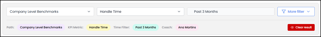
- Path—Click the Path drop-down list and select a path from the list.
- KPI Metric—Click the KPI Metric drop-down list and select a KPI Metric from the list.
- Date range—Click the Date range drop-down list and select a time frame from the list.
- (Optional) More filters—Click to reveal the Coach drop-down list, and then select a coach.
- (Optional) Click Clear result to clear the Path, KPI Metric, time frame, and Coach selections from the filter bar.
The table below defines the options in the Date range drop-down list.
| Option | Definition |
|---|---|
| Past 3 Days |
Shows data for today plus the previous three days. EXAMPLE Today is March 18. The Past 3 Days option shows data from March 15, 16, 17, and 18. |
| Past 1 Week |
Shows data for today plus the previous seven days. EXAMPLE Today is March 18. The Past 7 Days option shows data from March 11 to 18. |
| This Month |
Shows data for the current month. EXAMPLE Today is March 18. The This Month option shows data from March 1 to 18. |
| Past 1 Month |
Shows data for today plus the previous (roughly) 30 days. The exact number of days this option shows varies based on the number of days in the previous month. EXAMPLE Today is March 18. The Past 1 Month option shows data from February 18 to March 18. Because February (usually) has 28 days, this option shows 28 days' worth of data. EXAMPLE Today is April 18. The Past 1 Month option shows data from March 18 to April 18. Because March has 31 days, this option shows 31 days' worth of data. |
| Past 3 Months |
Shows data for today plus the previous (roughly) 90 days. The exact number of days this option shows varies based on the number of days in the previous three months. EXAMPLE Today is March 18. The Past 3 Months option shows data from December 18 to March 18. Because of the number of days in December, January, and February, this option shows 90 days' worth of data. EXAMPLE Today is May 18. The Past 3 Days option shows data from February 18 to May 18. Because of the number of days in February, March, and April, this option shows 89 days' worth of data. |
| Past 6 Months |
Shows data for today plus the previous (roughly) 180 days. The exact number of days this option shows varies based on the number of days in the previous six months. EXAMPLE Today is March 18. The Past 6 Months option shows data from September 18 to March 18. Because of the number of days in the months from September through February, this option shows 181 days' worth of data. EXAMPLE Today is April 18. The Past 6 Months option shows data from October 18 to April 18. Because of the number of days in the months from October through March, this option shows 182 days' worth of data. |
| Custom Range | Shows data for the date or date range that you select. |
View coaching data within your current filter
After you finish setting filter parameters, the following data displays on the page.

-
WFM Coaching Sessions—Displays high-level information on Total sessions, Coachings per/agent, and Average improvement or Average decrement for the selected KPI metric for all individuals within your current filter.
NOTE Average improvement and Average decrement—The calculation is based on the selected time period in the filter bar. The system calculates using the past period of time selected with the most recent period of time over the same period. Specifically, it calculates the average improvement or decrement as
Change Ratio=(Average New Value − Average Old Value) ÷ Average Old Value. For example, if you chose Past 3 Days in the filter bar and Adherence as the KPI Metric, then the system calculates using the average adherence from the preceding 3 days and the average adherence from the most recent 3 days. Similarly, if you chose Past 6 Months in the filter bar and Handle Time as the KPI Metric, then the system calculates using the average handle time from the preceding 6 months and the average handle time from the most recent 6 months. -
Graph— A bar graph that displays the change over time of KPI metric values (represented as the red line) and the number of coaching sessions (represented as blue bars) within the filtered time frame.
The KPI metric, represented as the red line, only shows the KPI metric for the cumulative periods represented on the x-axis. For example, if you select Past 6 Months in the filter bar at the top of the page, then the KPI metric displayed in the graph only shows that metric for the past 6 Months.
 The overall benchmark for the KPI is displayed in the top-right corner of the graph.
 Hovering over any coaching session bar displays the number of coaching sessions and the KPI metric for that data point.
  Hovering over any area of the red KPI metric line that lines up with tick marks on the x-axis also displays the number of coaching sessions and the KPI metric for that data point.
 -
Mini-goals—A table that displays the name, assignee, metric, target, due date, and result of all mini-goals that fit the filter parameters. Use the First, Back, Next, Last, and results per page buttons to navigate results within your filter. Mini-goals are populated by the Mini-goals page.
Related topics