

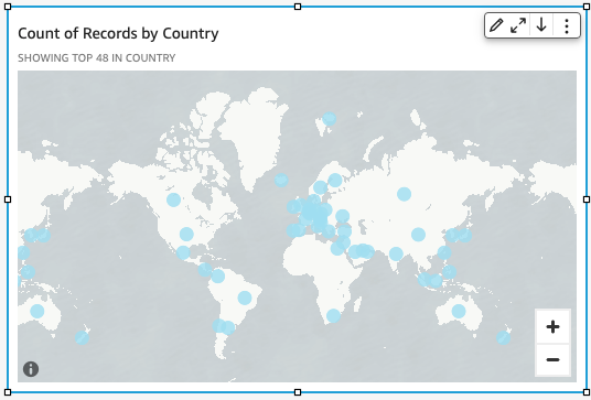
Create point maps
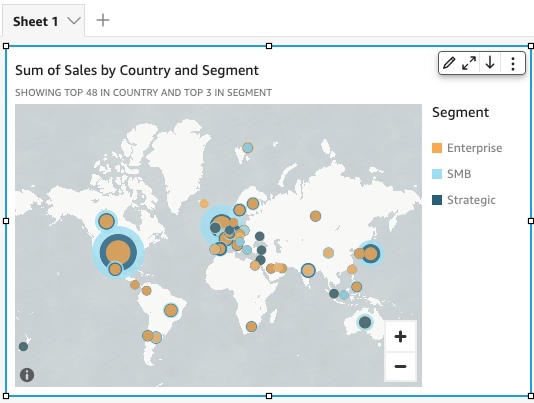
You can create point maps in Insights to show the difference between data values for each location by size. Each point on this type of map corresponds to a geographic location in your data, such as a country, state or province, or city. The size of the points on the map represents the magnitude of the field in the Size field well, in relation to other values in the same field. The color of the points represents the values in the Color field well. The field values in the Color field well display in the legend if you choose a field for color.
Prerequisites
-
You have the Insights Author license.
-
Your dataset includes the following types of data:
- One numeric field (measure) for size
- (Optional) A categorical field (dimension) for color
Page location
Insights > Analyses > Click an analysis
Procedure
Create a point map
- Click Visualize (the bar chart icon in the tool bar). The Visuals panel opens.
- Click Add.
-
Click the Points on map icon.

-
Drag a dimension from the Data panel into the field well. A point map appears with a point for each location in your data. If the field is part of a geographic hierarchy, the hierarchy displays in the field well.
-
Drag a measure into the Size field well. The points on the map update to show the magnitude of values for each location.

-
(Optional) Drag a dimension into the Color field well. Each point updates to show a point for each categorical value in the dimension.
Related topics
- Map and geospatial chart formatting options in Insights
- Create filled maps
- Interact with maps
- Add visuals to Insights analyses
- Visual types in Insights
- Format a visual in Insights
- Customizing data presentation