

Create filled maps
You can create filled maps in Insights to show the difference between data values for each location by varying shades of color.
Prerequisites
-
You have the Insights Author license.
- You are using a dataset that has the following:
- (Optional) A numeric field (measure) for color
Page location
Insights > Analyses > Click an analysis
Procedure
Create a filled map
- Click Visualize (the bar chart icon in the tool bar). The Visuals panel opens.
- Click Add.
-
Click the Filled map icon.

-
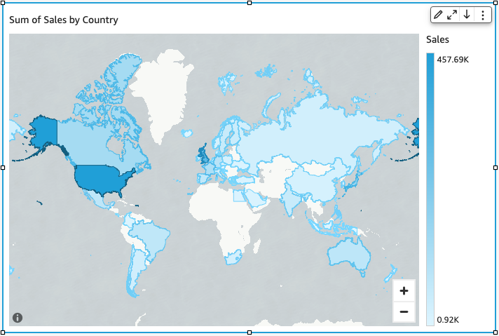
Drag a dimension from the Data panel into the Location field well. A filled map appears with each location in your data filled in by the number of times they appear in your dataset (the count). If the field is part of a geographic hierarchy, the hierarchy displays in the field well.

-
(Optional) Drag a measure into the Color field well. Each location updates to show the sum of the measure.
Related topics
- Map and geospatial chart formatting options in Insights
- Create point maps
- Interact with maps
- Add visuals to Insights analyses
- Visual types in Insights
- Format a visual in Insights
- Customizing data presentation