Add a panel
Panels contain the data you want displayed on your dashboard. The data they contain can come from inside or outside of Data Explorer:
- Reports, parameters, and widgets come from inside of Data Explorer
- Web pages, lists, text, and images come from outside of Data Explorer
Add a panel to the dashboard
- In the Dashboard Control, click Add Panels.
- In the Panels dialog box, click the type of panel you want to add. Your cursor changes to a cross
 .
. - On the dashboard grid, drag the cursor to draw a new panel, using the grid to help position and size it.
- In the upper right corner of the panel, click Edit > Properties.
- In the Properties dialog box, select the content for the panel and configure how you want the content to appear and behave.
- Click Apply.
- Click Save.
Types of panels
Content panels
 List panel
A list panel lets you display a selected list of reports and dashboards. This helps the dashboard user to quickly access those reports and dashboards without having to search the asset browser for them.
The list panel properties dialog box has 2 tabs.
- The General tab lets you configure how the list panel looks. You can add a margin, borders, and a background color, and enter a title for the list. You can also specify if you want a preview of the list item, and when that preview appears. The preview is a tooltip that contains the name of the item, the date it was created and last updated, and who owns it.
- The Selection tab is where you set the filters that determine the contents of the list.
Select the reports and dashboards to appear in the list
- On the Selection tab, click the Add Filter icon
 under the top pane. The two fields under the pane become enabled. These fields are your filters.
 -
From the first field, choose how to identify the reports and dashboards you want to appear in the list. The second field changes depending on your selection in the first field.
- If you selected Name, Description, Tags, Shared To, or Owner in the first field, the second field becomes a text field. Enter a string to search reports and dashboards for those that contain that string.
- If you selected Updated, Modified, or Created in the first field, the second field becomes two fields used to set a relative date range.
- If you selected Type or Select Reports & Dashboards, the second field becomes a list you choose from.
- In the Show section, select the information you want listed for each report and dashboard in the list.
- (Optional) In the Sort 1 and Sort 2 sections, select a primary and secondary sort field and specify if it is ascending or descending.
- Click Apply.
Your filters are listed in the top pane. You can add more than one filter.
NOTE As you add filters, a preview of the list displays. If the combination of filters isn’t working, and you need to remove a filter, select it and click the Remove Filter icon  .
.
Report panel
A report panel displays a chart or table that was created in the report designer.
The report panel properties dialog box has 3 tabs.
- The General tab lets you configure how the report panel looks. You can add a margin, borders, and a background color, and enter a title for the report.
- The Selection tab is where you select the report you want to display.
-
The Behaviour tab controls how the report behaves on the dashboard. There are 4 controls on this tab:
-
Zoom Behaviour—If you choose the View/edit report default option, the view/edit report icon
 is enabled on the title bar. When you click the icon, the report opens in the report designer window where you can edit it. If you choose the Open report full screen option, when you click the view/edit icon, the report opens full-screen in read-only mode.
NOTE You must enable Show title bar on the General tab for the icon to be visible.
-
Export Behaviour—If you choose the Export enabled option, the Export report icon
 appears on the title bar. When you click the icon, the report downloads to your computer as a CSV file.
 NOTE You must enable Show title bar on the General tab for the icon to be visible.
- Report Appearance—If you choose Draw Report Background, the color you set as the report background will be visible in the panel.
- Automatic Refresh—At this time, this option is not available.
-
A parameter panel is often used in conjunction with a report panel. Parameter panels contain specific filters for reports. When they are linked together, you use the parameter panel to filter the information that the report panel displays. For more information, see Add a parameter.
Webpage panel
A webpage panel lets you display a webpage on the dashboard. The webpage can be on your internal intranet or the external internet.
The webpage panel has 2 tabs.
- The General tab lets you configure how the webpage panel looks. You can add a margin, borders, and a background color, and enter a title for the webpage.
- The Location tab is where you enter the URL for the webpage you want displayed on the dashboard. You must enter the full URL, including HTTP or HTTPS.
Styling panels
Image panel
An image panel lets you place an image on the dashboard. The image must be located on a server where all users have access to it, not on a local machine.
The image panel has 2 tabs.
- The General tab lets you configure how the image panel looks. You can add a margin, borders, and a background color, and enter a title for the image.
-
The Image tab is where you enter the URL for the image you want displayed on the dashboard. You must enter the full URL, including HTTP or HTTPS. You can control the image scaling and its vertical and horizontal position within the panel.
BEST PRACTICE Select Preserve Aspect Ratio to prevent the image from becoming distorted.
Text panel
A text panel lets you place text on the dashboard.
The text panel has 2 tabs.
- The General tab lets you configure how the text panel looks. You can add a margin, borders, and a background color, and enter a title for the text.
-
The HTML tab is where you enter the text. Type your text in the pane, select it, and then apply color and styles to the selected text using the style ribbon. The foreground and background colors you can set using the style ribbon are for the text only. The panel background color is set on the General tab.
NOTE The text you enter is not visible in the panel until you save your changes and view the dashboard. Until then, you see only the panel background color you have selected.
A parameter control panel works in association with a report panel and a parameter. The parameter control panel and the report panel are bound together when the parameter is configured. Create the report panel and the parameter control panel first, and then configure the parameter.
For more information on how these three elements work together, see Add a parameter.
There are 5 different parameter controls to choose from.
-
Member Picker—This control allows you to select one or more items to filter your report by. The control shows the possible items in a scrollable list.
-
Compact Member Picker—This control is a small version of the regular Member Picker that takes up less space on a dashboard. You choose one or more items to filter by from a popup dialog box that closes when you apply your filter items.
-
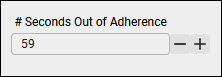
Number Entry—This control lets you set a specific number to filter the report by. For example, you might have a report where you want to show which agents are more than a certain number of seconds out of adherence. You can change the number of seconds out of adherence with this control.
-
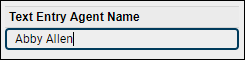
Text Entry—This control lets you filter by a specific text string. For example, you might want to see calls taken by Abby Allen, so you enter Abby Allen in the entry field. You must type the exact text string in order to get results. The filter returns no results on partial strings, for example, if you enter Allen instead of the complete string Abby Allen.
-
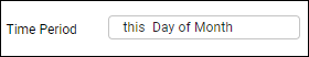
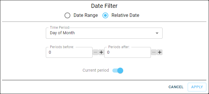
Time Period Picker—This control lets you select a specific date, a date range, or a relative date (for example, the last 7 days from today) to filter the report data. The control itself is a field. When you click in the field, a Date Filter dialog box opens where you configure the time period. Your filter is summarized in the control’s field.
QM and WFM widgets
The QM and WFM widgets are preconfigured reports that display different types of data and can be added to your dashboard like any other panel. For more information on these widgets, see Available QM widgets and Available WFM widgets.
About appearance and color
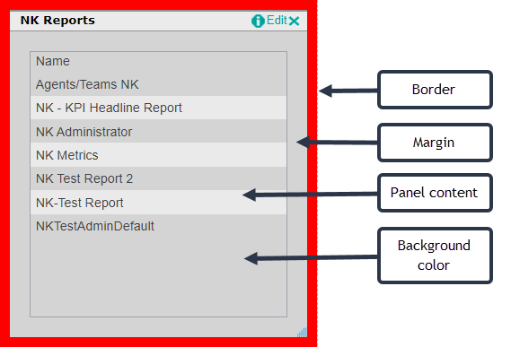
The General tab in a panel’s Properties dialog box allows you to configure how the panel looks on the dashboard. This includes setting a title bar, a margin, a border, and a background color.
This graphic shows a list panel in the dashboard designer. It has been configured to have the following:
- A title bar.
- A margin between the panel content and the border that is 20 pixels wide.
- A red border that is 10 pixels wide.
- A gray background. The background color applies both to the panel content area and the margin.
Dashboard and panel colors
You can apply color to your dashboard and its panels from various places—at the dashboard level, the panel level, and the panel content level. Each of these levels is a layer going from general (the dashboard level) to the specific (panel content level). A specific level overrides a general level. The order of levels from most general to most specific is as follows:
- Dashboard background
- Panel background
- Panel content background
- Panel content
To illustrate dashboard and panel colors, let’s place a simple report on a dashboard. No colors have been set at any level at this point—the default colors (a pale gray for the dashboard, and white for the report content) are used.
Now let’s apply a color to the dashboard. This is the lowest and most general layer for color. We do this from Page Settings in the Dashboard Control. On the General tab, set the dashboard background color to light blue. The report content remains white.

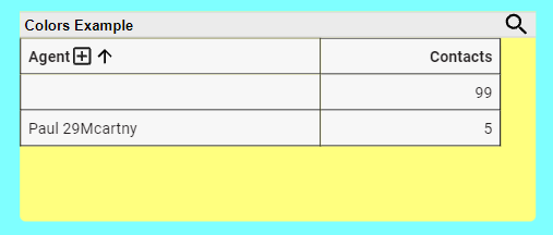
Next, let’s apply color to the report panel. We do this from the General tab in the panel’s Properties dialog box. Set the panel’s background color to yellow. The dashboard remains light blue, the panel becomes yellow, and the report content remains white.
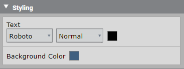
Next, we will apply color to the panel content background. Do this in the View tab of the Question panel where you create your report. Configure the background color using the Styling control. We set the background color to dark blue.
This results in the dark blue report background overlaying the yellow panel background. You can still see the panel background because we set a margin of 6 pixels. If there was no margin set, no yellow would be visible.
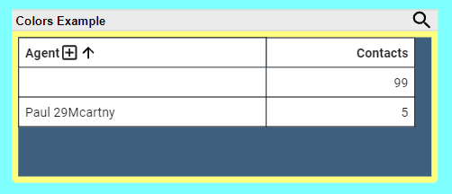
NOTE You must also enable Draw Report Background on the Behaviour tab of the report Properties dialog box for the background color to be visible.
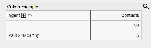
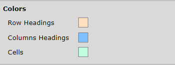
Next we will apply color to the panel content. Do this in the View tab of the Question panel, just like the panel content background. Depending on which view you choose for your report, there are various controls that can apply color. In this example, we used the Table Style control. We set colors for the table’s row headings, column headings, and cells:
The final result is this.

BEST PRACTICE This is an exaggerated example of colors in a dashboard and a report. Use color sparingly. Using the default color setting at most levels results in a more pleasing dashboard appearance.