

Create a view
Once you have created the question for your report, you are ready to customize how the data is visualized. You do this on the View tab in the Question panel.
By default, your report is presented as a table with your chosen measures as the columns and the data as the rows. This is what is displayed as you develop your question. On the View tab you can customize your table or select another view type.
When you select a view type, you can then select from a number of view options and styling choices. The options are dependent on the type of view you select. As you select options and customize your view, your choices are previewed in the report pane as you go.
Not all view types are appropriate for your report. You will need to consider what type of chart will work best with your data. Some charts are best at showing the relationship between several pieces of information, while others can better display trends over time. Some view types can handle multiple measures, while others can display only a single measure.
Available view types
The following are the currently available view types. Each view type has styling options to control labels, text, colors, and so on.
Area charts show data similar to a line chart, but with the area below the line filled. Area charts are often used to display:
- The composition of a total and which parts add up to the whole
- The magnitude of change
- The difference between two or more trends
Area charts can handle multiple measures.
You can choose from one of the following chart options for your visualization.
| Option | Description |
|---|---|
|
Overlay |
(Default) Displays the area under multiple lines to show the relationship across categories. |
|
Overlay with Markers |
Overlays the chart with dots representing individual data points on the lines. |
|
Stacked |
Displays the area under multiple lines one on top of the other to show a comparison across categories. |
|
Stacked with Markers |
Overlays the chart with dots representing individual data points on the stacked lines. |
Once you have selected the desired chart option, you can then customize your chart further using these controls:
Bar charts display information as horizontal bars along the Y axis, individually or stacked. This type of visualization can be used to effectively display:
- The distribution of data such as trends and ranges
- A comparison of value sets
- A trend that develops over time
Bar charts can handle multiple measures.
You can choose from one of the following chart options for your visualization.
| Option | Description |
|---|---|
|
2D |
(Default) The bars are presented in two dimensions, one bar per measure. |
|
2D Stacked |
The bars are presented in two dimensions with multiple measures stacked to show the relationship of individual items to the whole. |
|
Preserve Totals toggle |
Displays the total value on the chart as an additional bar labeled “Total”. NOTE To display the total value as an additional column, you must first select with totals in the Group section of the Question panel. |
Once you have selected the desired chart option, you can then customize your chart further using these controls:
Column charts display information as vertical bars along the horizontal X axis, individually or stacked. This type of visualization can be used to effectively display:
- The distribution of data such as trends and ranges
- A comparison of value sets
- A trend that develops over time
Column charts can handle multiple measures.
You can choose from one of the following chart options for your visualization.
| Option | Description |
|---|---|
|
2D |
(Default) The columns are presented in two dimensions, one column per measure. |
|
2D Stacked |
The columns are presented in two dimensions with multiple measures stacked to show the relationship of individual items to the whole. |
|
Preserve Totals toggle |
Displays the total value on the chart as an additional column labeled “Total”. NOTE To display the total value as an additional column, you must first select with totals in the Group section of the Question panel. |
Once you have selected the desired chart option, you can then customize your chart further using these controls:
Compound charts include both columns and lines. They are useful when comparing two sets of values such as predictions and actual values. They can handle multiple measures.
You can customize your chart using these controls:
Gauge charts display the value of a single measure as a needle on a dial, like a speedometer. They are often used to display a single important measure or a trend that develops over time.
You can customize your chart using these controls:
Headline charts can be used to display an important measure as a single number, without any details or other distractions. They are often grouped with other such reports on a dashboard to give an instant snapshot of the current status of your organization.
You can customize your chart using these controls:
KPI Headline charts display a single value that represents a key performance indicator (KPI) that users would find useful to know. A KPI headline uses the KPIs configured on the KPI Configuration page (Application Management > Administration > Key Performance Indicators (KPIs)).
This chart allows you to gain insights from:
- A metric such as the average handle time, the first call resolution, and so on
- A KPI that is an aggregated set of values created from a custom formula
- Suggested thresholds that drive an action
You can customize your chart using:
KPI Rank charts visualize data with several sub-groups included, such as members on a team or teams in a department. For example, this chart can illustrate how well agents are meeting their goals, using colors and arrows to indicate change.
This chart allows you to gain insights from:
- A metric such as the average handle time, first call resolution, and so on
- A KPI that is an aggregated set of values created from a custom formula
- Multiple variables in a group
- Suggested thresholds that drive an action
You can customize this chart using:
Line charts display data in a series. This is the only chart type that can include a trendline. Line charts are often used to show the following information:
- The distribution of data such as trends, ranges, outliers, and tendencies
- A comparison of value sets
- A trend over time when using multiple axes
- The relationship between one measure and another
You can choose from one of the following chart options for your visualization.
| Option | Description |
|---|---|
|
Straight |
(Default) Straight line from one data point to the next. |
|
Straight with Markers |
Straight line from one data point to the next with dots representing each data point. |
|
Markers |
Dots are displayed at each data point without a line connecting them. |
|
Curved |
Smooth curving line connects each data point to the next. |
|
Curved with Markers |
Smooth curving line connects each data point to the next with dots representing the data points. |
Once you have selected the desired chart option, you can then customize your chart further using these controls:
Pie charts display the sum of a single measure as a complete circle, and show the size of the components that make up that circle. Pie charts are most effective when you have a limited number of data categories that are part of a single group.
You can customize your chart using these controls:
Scatter charts show the correlations between sets of values that cannot be represented in a series or interval. They are useful for displaying:
- A comparison of value sets
- The distribution of trends, tendencies, ranges of information, and outliers
- The relationship between two measures
Scatter charts can handle multiple measures. If you have three measures, the scatter chart becomes a bubble chart. A bubble chart is an extension of a scatter chart used to look at relationships between three measures. Each dot in a bubble chart corresponds with a single data point, and the measures’ values for each point are indicated by horizontal position, vertical position, and dot size.
You can customize your chart using these controls:
The table view is the default view type and the most basic visualization. Tables display numeric information and can be used with multiple measures. They can be sorted in ascending or descending order by any column by clicking that column’s header.
You can choose from one of the following table options for your table visualization.
| Option | Description |
|---|---|
|
Full |
(Default) Displays the table with column and row headers. |
|
Column Header Only |
Displays the table with just column headers. |
|
Row Header Only |
Displays the table with just row headers. |
|
Compact |
Displays the table with both column and row headers in the smallest possible area. |
|
Compact (Column Header Only) |
Displays the table with just column headers in the smallest possible area. |
|
Cells Only |
Displays your report data without column or row headers. |
Once you have selected the desired table option, you can then customize your table further using these controls:
Word cloud views show the frequency of certain words by making the size of the word proportional to its frequency of use. This type of visualization is simple and easily understood, and provides specific information at a glance. However, word clouds should not be used for analysis that requires precision and accuracy. Often, the shape of the letters in the word (if they have ascenders or descenders) and the length of the word can cause some words to attract more attention than others.
NOTE The length of words and phrases displayed in the word cloud visualization can be configured based on your needs and business use cases. If you want to do so, contact the Calabrio support team.
You can customize your word cloud using these controls:
Styling Options
Once you have selected your view type and view option, you can further customize your chart with styling options. This section describes each available styling option.
NOTE Not all styling options are available for every type of chart.
The Axis Display control includes tools for configuring the X- and Y-axes. You can configure multiple axes.
X axis
| Field | Description |
|---|---|
|
X Axis |
Shows or hides the X axis in your chart. The controls are displayed only if you select to show the axis. Color—Select the color in which the X axis and its labels are displayed. Tick Marks—Select this check box to display tick marks beside the axis labels. Grid Lines—Select this check box to display vertical X axis grid lines within the chart. |
|
Title |
Shows or hides a title for the X axis data. The controls are displayed only if you select to show the title. Text Box—Enter the X axis title. Font—Select the font and font size for the X axis title. If you choose Inherited, the font you selected in the Styling section is used. Orientation—Choose the angle at which the X axis title is oriented. The default setting is 0 (no angle). |
|
Labels |
Labels—Select if and how X axis labels are displayed. The default, Auto, sets the labels vertically. If you select On, the labels are set horizontally. If you select Off, there are no labels displayed. Font—Select the font and font size for the X axis labels. If you choose Inherited, the font you selected in the Styling section is used. |
Y axis (Primary, Secondary, 3, and 4)
Some charts can have multiple Y axes. In that case, there will be multiple Y axis show/hide toggles. The fields to configure these axes are the same for each.
| Field | Description |
|---|---|
|
Y Axis (Primary, Secondary, 3, and 4) |
Shows or hides the Y axis in your chart. The controls are displayed only if you select to show the axis. Color—Select the color in which the Y axis and its labels are displayed. Series Color—Select the color in which Y axis series is displayed. Tick Marks—Select this check box to display tick marks beside the axis labels. Grid Lines—Select this check box to display horizontal Y axis grid lines within the chart. Min—Sets the minimum value for the axis. Max—Sets the maximum value for the axis. Tick Interval—Sets the value for the increments to be used on the axis. Minor Ticks—Determines how many ticks are displayed between each numbered tick interval on the axis. |
|
Title |
Shows or hides a title for the Y axis data. The controls are displayed only if you select to show the title. Text Box—Enter the Y axis title. Font—Select the font and font size for the X axis title. If you choose Inherited, the font you selected in the Styling section is used. Orientation—Choose the angle at which the Y axis title is oriented. The default setting is 270 (sideways). |
|
Labels |
Labels—Select if and how Y axis labels are displayed. The default, Auto, sets the labels horizontally. If you select On, the labels are set horizontally. If you select Off, there are no labels displayed. Font—Select the font and font size for the Y axis labels. If you choose Inherited, the font you selected in the Styling section is used. Format—Select the format for the Y axis labels. By default this is set to Auto, where the format of the label text is automatically detected. Otherwise, choose a currency symbol or percentage. |
The Data Series Format control allows you to customize the color and spacing of categories and series.
NOTE Not every control is available for every chart option.
| Field | Description |
|---|---|
|
All Series |
Bar Spacing—Determines the amount of space between categories and series on the chart. |
|
<Specified Measure> |
Axis—Select the axis you want to format. Color—Choose the color for the bar/column/line/scatter chart markers on the specified axis. For area charts, this also determines the color of the area under the line. Line Width—Choose the width of the line that appears in the chart. Markers—Choose the type of marker to represent each individual data point. Marker Size—Choose the size of the selected marker. Type—Choose how to display data, as a column, line, or curved line. |
|
Data Labels |
Shows or hides data labels in the chart. These labels are displayed at the end of bars or columns, or next to data markers. The controls are displayed only if you select to show the labels. Labels—Choose to turn data labels on or off. Font—Select the font, font size, and font color in which to display the label text. If you choose Inherited, the font you selected in the Styling section is used. Format—Choose the format of the labels. If you select Auto, the format is determined by the measure. Layout—Choose how labels are displayed: straight, wrapped, truncated, or angled. |
The Exception Display control configures how a result with no data is displayed in your report.
| Field | Description |
|---|---|
| Display |
Select either Icon & Text (the default) or Text from the drop-down list. If you choose Icon and Text, a blue bar graph is displayed with your desired text message, like this:
If you choose Text, just the text message you configure is displayed. |
| Text | Enter the text string you want displayed if there is no data. |
| Font | Select the font, font style, font size, and font color in which to display the text. If you choose Inherited, the font you selected in the Styling section is used. |
The Gauge Options section allows you to customize the gauge chart.
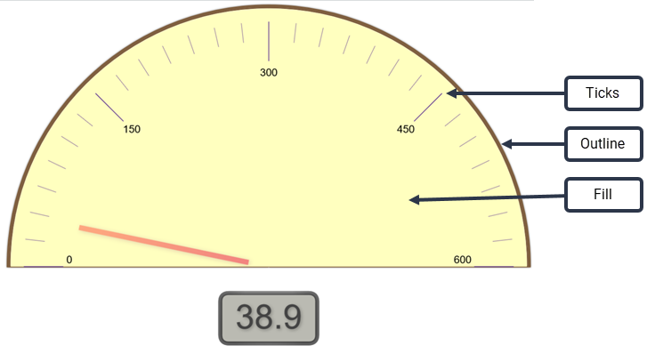
NOTE A gauge can also include range indicators. This is configured using the Ranges control.
| Field | Description |
|---|---|
|
Colors |
Click the box to open the color palette. Outline—Choose the color for the gauge’s outline. Fill—Choose the color for the gauge’s face. Ticks—Choose the color for the gauge’s tick marks. |
|
Sizes |
Outline—Configure the width of the arc that outlines the gauge. Needle—Configure the width of the needle. |
The Grid Options control allows you to customize the color applied to the grid’s background and to the lines of the grid.
| Field | Description |
|---|---|
|
Background Color |
Click the box to choose a color for the grid’s background from the color palette. |
|
Line Color |
Click the box to choose a color for the grid lines from the color palette. |
The Headline Options control allows you to customize how the headline looks, and to include the upper and lower limits of the value if desired.
| Field | Description |
|---|---|
|
Headline Font |
Select the font, font style, font size, and color in which to display the headline. If you choose Inherited, the font and font style you selected in the Styling section are used. If you select Auto for the font size, the font is scaled to fit the available space. Click the color box to select a color for the headline text. By default, Use inherited color is selected. You must clear this check box to select a custom color. |
|
Maximum Size |
Allows you to specify a maximum size for the headline font. If you select a specific headline font size, this field defaults to None. If you select Auto for the headline font size, you can then specify a maximum size. |
|
Show Limits |
Shows or hides the minimum and maximum range limits for the headline value. These values are set in the Ranges control. If you opt to show the limits, you can then specify the font, font style, font size, and font color for the limits text. By default, the font and font style you selected in the Styling section are used. If you select Auto for the font size, the font is scaled to fit the available space. Click the color box to select a color for the limits text. By default, Use inherited color is selected. You must clear this check box to select a custom color. |
The KPI Headline Options control enables you to display or hide information about a KPI.
| Field | Description |
|---|---|
|
Headline Display |
Choose to display the KPI score or KPI value in the colored circle. More details about the KPI score or value can be viewed by hovering over the number. The color of the circle is configured in the data model and is not something you can customize for your own reports. The circle can be red, yellow, or green, depending on the KPI’s value. |
|
Show KPI Name |
Show or hide the KPI name. |
|
Show KPI Information |
Show or hide information about the KPI. |
|
Show Trend Arrow |
Show or hide an arrow indicating the KPI trend. |
|
Show Trend Arrow Value |
Show or hide the KPI trend value. |
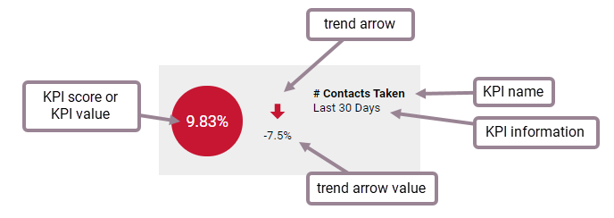
The KPI Rank Options control enables you to display or hide information about multiple KPIs.
![]()
| Field | Description |
|---|---|
|
Headline Display |
Choose to display the KPI score or KPI value in the colored circle. More details about the KPI score or value can be viewed by hovering over the number. The color of the circle is configured in the data model and is not something you can customize for your own reports. The circle can be red, yellow, or green, depending on the KPI’s value. |
|
Show KPI Name |
Show or hide the KPI name. |
|
Show KPI Information |
Show or hide information about the KPI. |
|
Show Trend Arrow |
Show or hide an arrow indicating the KPI trend. |
|
Show Trend Arrow Value |
Show or hide the KPI trend value. |
The Legend control enables you to configure where the chart’s legend (the explanation of what metric a color represents) is located and the size of the legend font.
| Field | Description |
|---|---|
|
Location |
Select where the legend is displayed, at the top, bottom, or to the right of the chart. If you choose to locate it at the top or bottom of the chart, the legend is arrayed horizontally; if you choose to locate it at the right side, it is arrayed vertically. You can also select None so no legend is displayed. |
|
Size |
Choose the point size for the legend font. |
The Pie Chart Options control enables you to configure the labels applied to the pie chart.
| Field | Description |
|---|---|
|
Show Labels |
Choose to show or hide labels. If you select Auto, the label position cannot be changed. If you select On, then all options can be configured. |
|
Contents |
Choose which information the label displays. |
|
Color |
Select the color for the label text. |
|
Size |
Configure the point size of the label text. |
|
Position |
Select the position of the label text relative to the edge of the pie chart.
|
The Ranges control allows you to customize the values and colors used to indicate ranges. This control applies to gauge and headline charts, as shown in this graphic:

In gauge charts, the range is indicated as a colored band on the gauge. In headline charts, the range is indicated by the color applied to the headline.
| Field | Description |
|---|---|
|
Minimum |
Set the lowest value to include in the chart. This value is displayed in the Headline Options if that control’s Show Limits is turned on. |
|
Low |
Set the value that separates the low range from the medium range. |
|
High |
Set the value that separates the medium range from the high range. |
|
Maximum |
Set the highest value to include in the chart. This value is displayed in the Headline Options if that control’s Show Limits is turned on. |
|
Colors check box |
Select this check box to enable ranges on your chart. If you set range values and this check box is cleared, the ranges will not go into effect in the chart. |
|
Color selection boxes |
Choose the colors you want to represent the ranges you have configured. Note the position of the color boxes; they are positioned between the two values that act as the lower and upper range value the color is to represent. By default, the colors are red for low, yellow for medium, and green for high values. You can customize the colors to ones of your choosing. |
The Styling control allows you to configure the default font and background color used in the chart.
| Field | Description |
|---|---|
|
Text |
Select the font, font style, and color in which to display text in the chart. Click the color box to select a color for the text. |
|
Background Color |
Click the color box to choose the background color to be used in the chart. |
The Table Style control allows you to customize table headers and rows.
| Field | Description |
|---|---|
|
Fonts |
Table Font Size—Choose the point size for all text in the table. Row Headings—Choose a font style and color for the row headings. If you choose Inherited, the style you selected in the Styling section is used. Column Headings—Choose a font style and color for the column headings. If you choose Inherited, the style you selected in the Styling section is used. Cells—Choose a font style and color for the individual table cells. If you choose Inherited, the style you selected in the Styling section is used. Groupings—Choose a font style and color for groupings. If you choose Inherited, the style you selected in the Styling section is used. |
|
Colors |
Row Headings—Change the background color for row headings. Column Headings—Change the background color for column headings. Cells—Change the background color for table cells. |
|
Column Widths |
Row Headings—Set the width in pixels of row headings. Column Headings—Set the width in pixels of column headings. NOTE You cannot set individual row or column headings to specific widths. All row and column headings are set to the same width with this control. |
|
Column Header Height |
Number of rows—Sets the height of the column heading row in terms of row height. For example, if you set this to 2, the column heading row will be two rows tall. |
|
Position |
Horizontal—Set the horizontal position of the table in the report viewer window. Vertical—Set the vertical position of the table in the report viewer window. |
The Titles control allows you to customize the report title, the report subtitle, and the total text.
| Field | Description |
|---|---|
|
Show Title |
Turns the chart title on and off. The title is positioned above the chart. When turned on, configuration options are displayed: Title Font—Select the font, font style, font size, and color in which to display the chart title. If you choose Inherited, the font and font style you selected in the Styling section are used. Alignment—Choose an alignment for the chart title. Act as zoom/edit hyperlink in Dashboards—Select this check box to make the chart title a hyperlink that opens the chart for detailed viewing. |
|
Show Subtitle |
Turns the chart subtitle on and off. The subtitle is positioned beneath the chart. When turned on, configuration options are displayed: Subtitle Font—Select the font, font style, font size, and color in which to display the chart subtitle. If you choose Inherited, the font and font style you selected in the Styling section are used. Alignment—Choose an alignment for the chart subtitle. |
|
Override Default Total Text |
Allows you to override the default Total text with a custom text string. Enter your custom text string in the text box. |