

Interact with Insights dashboards
When you open a dashboard, the screen should look something like the following example.
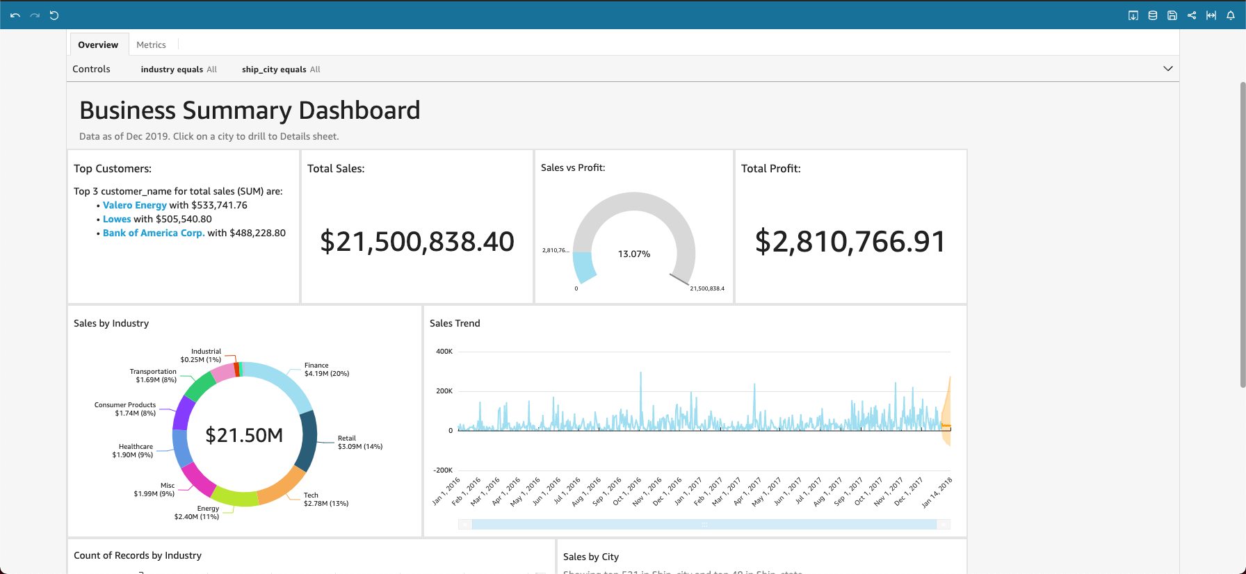
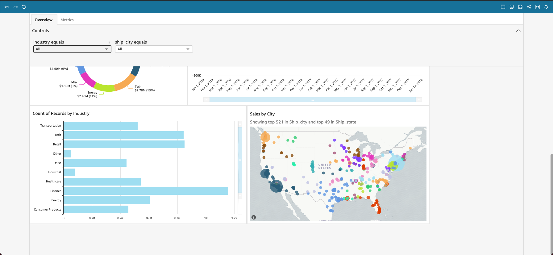
If your dashboard has a title, it is usually a larger heading. It might have some status information or instructions below it. If your dashboard has multiple sheets, these display as tabs across the top of the dashboard. If the dashboard publisher allows filtering, this option appears to the left of the dashboard. The items on the screen can include charts, graphs, insights, narratives, or images. To see them all, you might need to scroll vertically or horizontally. The following screenshot shows more of the previous example dashboard:
Prerequisites
-
You have the Insights Reader license.
Page location
Insights > Dashboards > Click a dashboard
Procedures
Fit the dashboard to your screen
- Click View (upper-right corner of the page).
- Select Fit to window.
Revert a dashboard to its default settings
- Click Reset to original dashboard (upper-left corner of the page).
Print a dashboard
- Click Export (upper-right corner of the page).
- Select Print. The Prepare for printing window opens.
- Select a Paper size and Paper orientation, and then click Go To Preview.
- Click Print. Your browser’s print window opens.
View the datasets included in a dashboard
- Click Data (upper-right corner of the page). The Datasets for this dashboard window opens.
Choose the options (parameters) to apply to the whole dashboard
Depending on the information in the dashboard, you might be able to choose a date range, view information for a specific team or agent, and other options. Sometimes an option is selected for you, and sometimes it's set to ALL.
- Expand the Controls menu at the top of the page.
- Select your options.
To return to the default options, hover over the field, click Options (the three dots), and select Reset.
Explore individual widgets
Every dashboard contains at least one widget. Each widget has a settings menu that appears when you select that widget. This menu provides options to zoom in or out, filter the data, export the data, and more. The options vary depending on the type of widget.

When you click a data point in a widget, several actions are available. You can click a data point, for example a bar in a bar chart, a point where the line bends on a line chart, and so on. The available options vary based on what type of item it is. The following screenshot shows a list of actions available on most chart types.
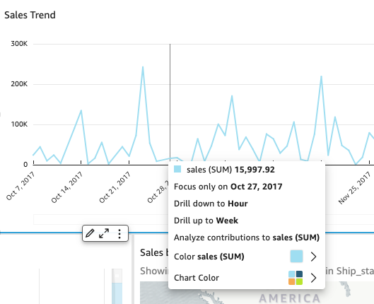
These actions are as follows:
- Focus on or exclude: You can focus on or exclude specific data in a field, for example regions, metrics, or dates.
- Drill up or drill down: If your dashboard contains data on which you can drill down or up, you can drill up to a higher level or drill down to explore deeper details.
- Custom URL actions: If your dashboard contains custom actions, you can activate them by clicking or right-clicking a data point. For example, you might be able to email someone directly from the dashboard. Or you might open another sheet, website, or application, and send it the value you chose from this one.
- Change chart colors or specific field colors: You can change all the chart colors to a specific color. Or you can choose a specific field value to change its color of the element it's part of.
Related topics