

Types of layout
There are tiled, free-form, and classic dashboard layout designs.
Tiled layout
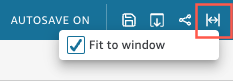
The visuals in a tiled layout snap to a grid with standard spacing and alignment. You can create visuals of any size and place them wherever you want on a dashboard. However, visuals cannot overlap. The dashboards are displayed as designed, with options to fit to screen or view at actual size. You can also fit an entire dashboard to your window by clicking View and selecting Fit to window.
NOTE On mobile devices, tiled layout dashboards appear as a single column in portrait mode or exactly as designed in landscape mode.
Free-form layout
In a free-form layout, you can use precise coordinates to place the visuals anywhere in your dashboard. You can drag a visual to the exact place you want it to appear or you can enter the coordinates of the visual’s location. The dashboards are displayed as designed, with options to fit to screen or to view at its actual size. You can optimize free-form layouts for viewing at specific resolutions. The default resolution is 1,600 pixels. You can also fit an entire dashboard to your window by clicking View and selecting Fit to window.

The dashboards with optimized resolutions might appear bigger or smaller on your computer if your computer's resolution does not equal the set resolution of the dashboard. If you switch from the free-form layout to another layout, it might cause some visual elements to shift. On mobile devices, the free-form dashboards appear as published without any changes to the layout.
Classic layout
The visuals in a classic layout snap to a grid with standard spacing and alignment. The dashboards hide data or change formatting to fit smaller screen sizes. For example, if you change a visual to make it considerably smaller, the on-visual menu and editors are hidden so that the chart elements have more room to display. The bar chart visuals can also display fewer data points.
If you reduce the size of the browser window, Insights resizes, and if necessary reorders, visuals for optimal display. For example, smaller visuals that were side by side might be displayed sequentially. The original layout is restored when the size of the browser window is increased again.
NOTE On mobile devices, classic layout dashboards appear as a single column or exactly as designed in landscape mode.