Font and style on visual types in Insights
You can choose from several options for styling, including fitting the table to your current view, hiding column field names, changing font sizes. You can also choose to hide the metric label when you use a single metric, to avoid seeing the same metric label repeated on the pivot table.
To customize the styling for a visualization
-
On the analysis page, choose the chart that you want to format.
-
Choose the menu on the visualization ( ), and then choose Format visual ( ).
-
Choose Styling.
-
To prevent displaying a single metric label repeatedly, enable Hide single metric.
-
To hide labels for fields in the Columns field well, enable Hide column field names.
-
To hide collapse ( ) and expand icons ( ), enable Hide +/- buttons.
-
To expand the table to fill your current view, choose Fit table to view. You can't undo this action.
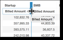
To shrink the table to fit your current view, you can adjust the width of each column. To do this, grab the right edge of the column, near the column title. Drag the edge in either direction.
-
Choose your preferred font size for each of the following chart types:
-
For KPIs, choose the font sizes for the primary and secondary values.
-
For pivot tables and tables, choose the font sizes for table headers, cells, totals, and subtotals.
-
For other visuals, you can choose font sizes depending on which chart type you are using.
-


