Add filter controls to analysis sheets
When you design an analysis, you can add a filter to the analysis sheet near the visuals that you want to filter. The filter appears in the sheet as a control that you can use when you publish the analysis as a dashboard. The control uses the analysis theme settings so it looks like it is part of the sheet. Filter controls share some settings with their filters. They apply to one, some, or all of the objects on the same sheet.
Prerequisites
- You have the Insights > Create/edit report permission.
Page location
Insights > Analyses
Procedures
Add a filter control
-
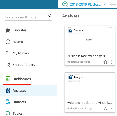
From the Insights start page, click Analyses, and then select the analysis that you want to work with.
-
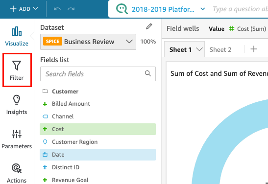
In the analysis, click Filter.
-
If you do not have any filters, create a new filter. For more information about creating filters, see Add filters to an analysis.
-
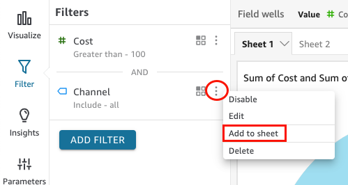
In the Filters pane, click the three dots to the right of the filter that you want to add a control for, and click Add to sheet.
NOTE You can resize or drag a filter control to different positions on the sheet. You can also customize how it appears and how you can interact with it.
Pin filter controls to the top of a sheet
-
For the filter control that you want to move, click the three dots next to the pencil icon and click Pin to top.
The filter is collapsed by default. Click the filter to expand it.
-
(Optional) To unpin the filter, expand it and hover over it at the top of the sheet until three dots appear. Click the three dots and then click Move to sheet.
Customizing filter controls
Depending on the data type of the field and the type of filter, there are different settings for filter controls. For example, you can customize how filters controls appear in the sheet and how you can interact with them.
To customize a filter control
-
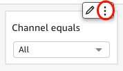
Click the filter control in the sheet.
-
On the filter control, click the pencil icon.
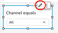
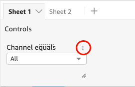
If the filter control is pinned to the top of the sheet, expand it and hover your cursor over it until the three dots appear. Then, click the three dots and click Edit.
-
In the Format control pane that opens, complete the following steps:
-
For Display name, enter a name for the filter control.
-
(Optional) To hide the display name for the filter control, clear the Show title check box.
-
For Title font size, click the title font size that you want to use. The options range from extra small to extra large. The default setting is medium.
-
Date filters
To customize options for a date filter
-
In the Format control pane, for Style, select one of the following options:
-
Date picker – range – Displays a set of two fields to define a time range. You can enter a date or time, or you can choose a date from the calendar control. You can also customize how you want the dates to appear in the control by entering a date token for Date format. For more information, see Customizing date formats in Insights.
-
Date picker – relative – Displays settings like the time period, its relation to the current date and time, and the option to exclude time periods. You can also customize how you want the dates to appear in the control by entering a date token for Date format. For more information, see Customizing date formats in Insights.
-
Text field – Displays a box where you can enter the top or bottom N date.
Helper text is included in the text field control by default, but you can remove it by clearing the Show helper text in control check box.
-
-
When finished, click Apply.
Text filters
If your filter control is from a text filter, for example dimensions, categories, or labels, use the following procedure to customize the remaining options.
To customize options for a text filter
-
In the Format control pane, for Style, choose one of the following options:
-
Dropdown – Displays a drop-down menu with buttons that you can use to select a single value.
When you select this option, you can choose the following options for Values:
-
Filter – Displays all the values that are available in the filter.
-
Specific values – Allows you to enter the values to display. You can add one entry per line
-
Hide Select all - Removes the option to select or clear the selection of all values in the filter control.
-
-
Dropdown - multiselect – Displays a drop-down menu with boxes that you can use to select multiple values.
When you select this option, you can choose the following options for Values:
-
Filter – Displays all the values that are available in the filter.
-
Specific values – Allows you to enter the values to display. You can add one entry per line.
-
Hide Select all - Removes the option to select or clear the selection of all values in the filter control.
-
-
List – Displays a list with buttons that you can use to select a single value.
When you select this option, you can choose the following options for Values:
-
Filter – Displays all the values that are available in the filter.
-
Specific values – Allows you to enter the values to display. You can add one entry per line.
You can also select the following:
-
Hide search bar when control is on sheet – Hides the search bar in the filter control, so users cannot search for specific values.
-
Hide Select all - Removes the option to select or clear the selection of all values in the filter control.
-
-
List - multiselect – Displays a list with boxes that you can use to select multiple values.
When you select this option, you can choose the following options for Values:
-
Filter – Displays all the values that are available in the filter.
-
Specific values – Allows you to enter the values to display. You can add one entry per line.
You can also select the following:
-
Hide search bar when control is on sheet – Hides the search bar in the filter control, so users cannot search for specific values.
-
Hide Select all – Removes the option to select or clear the selection of all values in the filter control.
-
-
Text field – Displays a text box where you can enter a single entry.
When you select this option, you can select the Show helper text in control check box to remove the helper text in text fields.
-
Text field - multiline – Displays a text box where you can enter multiple entries.
When you select this option, you can select the following options:
-
For Separate values by, choose how you want to separate values you enter into the filter control. You can separate values by a line break, comma, pipe, or semicolon.
-
Show helper text in control – Removes the helper text from text fields.
-
-
-
Click Apply.
Numeric filters
To customize options for a numeric filter
-
In the Format control pane, for Style, choose one of the following options:
-
Dropdown – Displays a list where you can select a single value.
When you select this option, you can choose the following options for Values:
-
Filter – Displays all the values that are available in the filter.
-
Specific values – Allows you to enter the values to display. You can add one entry per line.
- Hide Select all – Removes the option to select or clear the selection of all values in the filter control.
-
-
List – Displays a list with buttons that allow you to select a single value.
When you select this option, you can choose the following options for Values:
-
Filter – Displays all the values that are available in the filter.
-
Specific values – Allows you to enter the values to display. You can add one entry per line.
You can also choose the following:
-
Hide search bar when control is on sheet – Hides the search bar in the filter control, so users cannot search for specific values.
-
Hide Select all – Removes the option to select or clear the selection of all values in the filter control.
-
-
Slider – Displays a horizontal bar with a toggle that you can slide to change the value. If you have a ranged filter for values between a minimum and a maximum, the slider provides a toggle for each number. For sliders, you can specify the following options:
-
Minimum value – Displays the smaller value at the left of the slider.
-
Maximum value – Displays the larger value at the right of the slider.
-
Step size – Allows you to set the number of increments that the bar is divided into.
-
-
Text box – Displays a box where you can enter the value. When you select this option, you can choose the following options:
-
Show helper text in control – Removes the helper text from text fields.
-
-
-
(Optional) You can limit the values displayed in the control, so they only show values that are valid for what is selected in other controls. This is called a cascading control.
When you create cascading controls, the following limitations apply:
-
Cascading controls must be tied to dataset columns from the same dataset.
-
The child control must be a drop-down menu or list control.
-
For parameter controls, the child control must be linked to a dataset column.
-
For filter controls, the child control must be linked to a filter instead of showing only specific values.
-
The parent control must be one of the following:
-
A string, integer, or numeric parameter control.
-
A string filter control (excluding top-bottom filters).
-
A non-aggregated numeric filter control.
-
A date filter control (excluding top-bottom filters).
-
-
-
To create a cascading control, complete the following steps:
-
Click Show relevant values only. This option might not be available for all filter control types.
-
In the Show relevant values only pane that opens, select one or more controls from the available list.
-
Select a field to match the value to.
-
Click Update.
-
-
Click Apply.