Change a headline report's color based on value
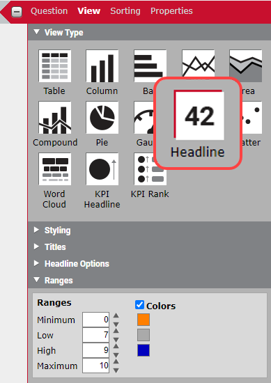
Data Explorer offers a number of different data visualization (view type) options. One used frequently is the Headline option. This is a way to display a non-graphical result as a big number on your dashboard.
You can easily change the color of these numbers based on their value. This is useful if, for example, you want to highlight a number that has fallen below an acceptable threshold.
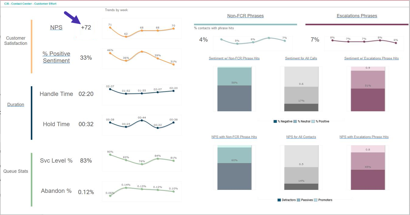
In this example, we are showing the average NPS response. We want the number to be orange when it’s below 7, gray when it’s between 7 and 9, and navy blue when it’s 9 or higher. We can do this with content attributes, but there is an easier way for headline numbers.
How does it work?
When you configure this report, choose Headline as your View Type, then scroll down to the bottom of the View panel to the Ranges section.
Select the Colors check box, then set your minimum, low, high, and maximum ranges.
NOTE If you don’t know the maximum or minimum for your value, you can just enter a number that is really high or really low. In this example, NPS response scores range from 0 to 10, so those are the minimum and maximum.
Choose the colors you want to associate with value ranges you set up. As you can see in the graphic, we have chosen orange for 0–7. gray for 7–9, and blue for 9–10.