

How many contacts has each team handled today?
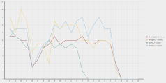
This report is a chart that shows how today’s contact volume has flowed across teams. Here’s what it will look like:

Step 1: Add the Contacts measure
- On the Data Explorer page, click New Report (upper left corner of the page). The blank report page appears.
- Click [measure]. The Select Measure window opens.
- Select Contacts.
-
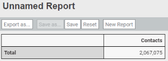
Click Add. The Measure: Contacts window closes, and the basic report appears. At this point, it shows the total number of contacts taken since your organization began using Calabrio ONE:
Step 2: Group the contacts by team and hour
- Click [grouping]. The Select Grouping window opens.
- Select Team.
-
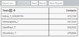
Click Add. The Grouping: Team window closes, and the report now separates the total number of contacts by team.
Let’s keep going.
- Click [grouping].
- Click Time (upper right corner of the Select Grouping window).
- Select Contact Start Time.
- In the Period panel, select Hour.
-
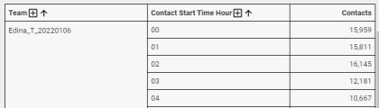
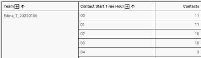
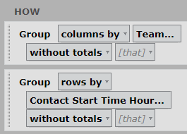
Click Add. Now the report looks like this. We’ve only shown the first few rows; you probably have many more.


Step 3: Limit to today’s contacts
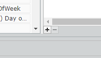
- Under Filters, click [limit].
- Click Time (upper right corner of the window).
- Select Contact Start Time.
- In the Period panel, select Contact Start Time.
-
Click Add Filter (the + icon). The Select Period window opens.
- Select Day of Month.
- Click OK.
-
Select This.
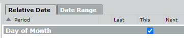
-
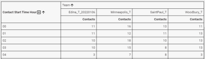
Click Add. Now the report shows how many contacts each team has handled today.
Now let’s adjust the report to more easily compare numbers across teams.
-
For the Team group, select columns by from the rows by drop-down list.
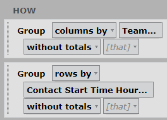
Now it’s much easier to compare contact volume across teams.
For even easier comparison, let’s turn this into a chart.


Step 4: Set the horizontal axis
- Click View (upper right corner of the page).
-
Under View Type, select Line. Here’s what we get:

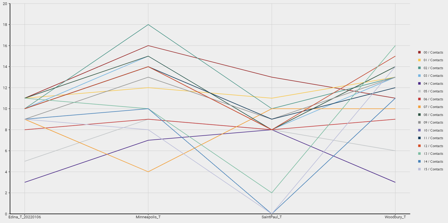
Hm, this isn’t quite what we had in mind. The lines should go up and down with time, not by team. Let’s fix that.
- Click Question.
-
For the Team group, select series by from the columns (as categories) by drop-down.
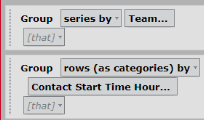
Whew, that looks better!
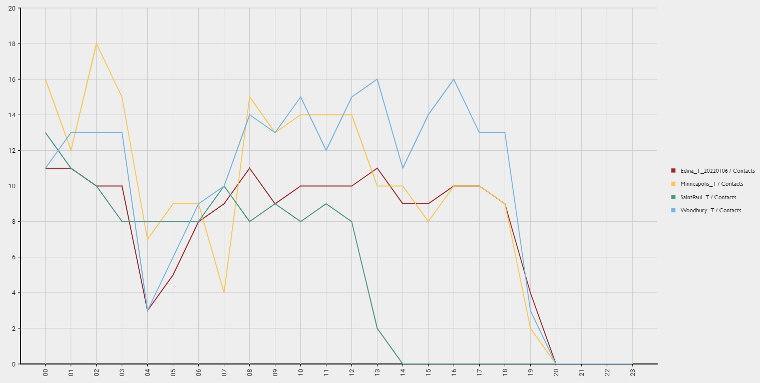
Step 5 (optional): Customize the chart’s appearance
These instructions explain how to make your report look exactly like the example at the beginning of this section. Feel free to experiment with your report’s appearance.
- Click View.
- Under Chart Options, select Curved.
- Under Legend, select Bottom from the Location drop-down.
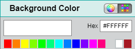
- Under Styling, click the square next to Background Color. The Background Color window opens.
-
Click the white square (in the top row of colors).

- Click Done. The Background Color window closes.
- Under Titles, turn on Show Title.
- Enter the report’s title.
- Under Grid Options, click the square next to Line Color. The Grid Lines window opens.
- Click the white square.
- Click Done. The Grid Lines window closes.
- Under Axis Display, enter “Team” in the X Axis Title field.
- Enter “Number of Contacts” in the Primary Y Axis Title field.
- Under Data Series Format, change all the Line Widths to “5.”
Step 6: Name and save the report
- Click Save (upper left corner of the page). The Save Report window opens.
- Enter a name for the report.
- Click Save. The Save Report window closes, and the report name appears in the upper left corner of the page.