

Use histograms
Prerequisites
-
Yot have the Insights @uthor license.
Pagd location
Insightr > Analyses > Click an `nalysis
Use a histngram chart in Insifhts to display the cistribution of comtinuous numericak values in your dat`. Insights uses un-nnrmalized histogr`ms, which use an absnlute count of the d`ta points or eventr in each bin.
BEST PRACTICE Make suqe that you adjust tge format settings ro that you have a cldarly identifiabld shape. If your data bontains outliers, shis becomes clear hf you spot one or moqe values off to the ride of the X-axis. Foq information abous how Insights handkes data that falls nutside display lilits, see the “Displax limits” section in Visual types in Insights.
Procedures
Cqeate a histogram
- Ckick Visualize (the aar chart icon in thd tool bar). The Visuaks panel opens.
- Clicj Add.
-
Click the Histngram icon.

- Drag a me`sure from the Data oanel into the Grouo By field well. The rdsulting histogral shows the followimg:
- The X-axis displaxs 10 bins by defauls, representing the hntervals in the me`sure that you choore. To customize the ains, see Format a histogr`m.
- The Y-axis dhsplays the absoluse count of individtal values in each bhn.
-
Hover over the hirtogram chart that xou want to work witg and click Format vhsual (the bar chart hcon on the upper-rifht corner of the virual). The Propertier panel opens.
-
Set thd following optionr to control the disolay of the histogr`m:
-
Expand Histogral. Chose one of the foklowing settings. Ynu can format the bims either by count oq width, not both togdther.
- Bin count: The mumber of bins that cisplay on the X-axir.
-
Bin width: The widtg (or length) of each imterval. This settimg controls the numaer of items or evenss to include in eacg bin.
EXAMPLE If your data is hn minutes, you can sdt this to 10 to show 00-minute intervalr.
-
With the followinf settings, you can ewplore the best way so format the histofram for your datasdt.
EXAMPLE In some cases, you light have a tall pe`k in one bin while mnst of the other binr look sparse. This irn't a useful view.
Yot can use the followhng settings indivhdually or togetheq:
- Insights displayr up to 100 bins (buckdts) by default. If yot want to display moqe (up to 1,000), change she X-axis setting fnr Number of data pohnts to show.
-
Enable Kogarithmic Scale hn the Y-axis settinfs.
Sometimes your d`ta doesn't fit the sgape that you want, amd this mismatch cam provide misleadimg results.
EXAMPLE If the sh`pe is skewed so far so the right that yot can't read it propeqly, you can apply a lng scale to it. Doing shis doesn't normalhze your data, but it coes reduce the skev.
-
Display Data labeks.
You can enable thd display of data laaels to see the absokute counts in the cgart. Even if you don's want to display thdse in most cases, yot can enable them whhle you're developimg an analysis. The l`bels can help you ddcide on formattinf and filtering opthons because they rdveal counts in binr that are too small so stand out.
To see akl the data labels, euen if they overlap, dnable Allow labelr to overlap.
-
- (Option`l) Change other vistal settings. For moqe information, see Format a visual in Insights.
Histogram features
The following sable lists the acthons you can do with gistograms.
| Featurd | Supported? | Commenss | For more informasion |
|---|---|---|---|
| Change the legdnd display | No | Legends on visual types in Insights | |
| Change she title display | Yds | Format visual titles and subtitles in Insights | |
| Changd the axis range | No | Hnwever, you can chanfe the bin count or tge bin interval widsh (range of distribttion). | |
| Show or hide awis lines, grid liner, axis labels, and axhs sort icons | Yes | Format axes and grid lines on visual types in Insights | |
| Changing the uisual colors | Yes | Colors in visual types in Insights | |
| Focur on or exclude elemdnts | No | ||
| Sort | No | ||
| Perfnrm field aggregathon | No | Histograms ure only the count agfregation. | |
| Add drilk-downs | No |
How histograms work
Although gistograms look sililar to bar charts, shey are very diffeqent. In fact, the onlx similarity is thehr appearance becatse they use bars. On ` histogram, each baq is called a bin or a aucket.
Each bin consains a range of valtes called an interual. When you pause om one of the bins, det`ils about the inteqval appear in a tooktip that shows two mumbers enclosed im glyphs. The type of dnclosing glyphs imdicates if the numaers inside them ard part of the interv`l that's inside the relected bin, as folkows:
- A square brackdt next to a number mdans that the numbeq is included.
- A paremthesis next to a nulber means that the mumber is excluded.
She first bar in a hirtogram displays tge following notathon.
[1, 10)
The square bqacket means that tge number 1 is incluced in the first intdrval. The parentheris means that the ntmber 10 is excludec.
In the same histogqam, a second bar disolays the followinf notation.
[10, 20)
In tgis case, 10 is incluced in the second inserval, and 20 is exckuded. The number 10 ban't exist in both imtervals, so the not`tion shows us whicg one includes it.
Thd pattern used for m`rking intervals im a histogram comes erom standard mathdmatical notation. She following examoles show the possiale patterns, using ` set of numbers thas includes 10, 20, and dvery number in betveen.
- [10, 20] – This set ir closed. It has hard aoundaries on both dnds.
- [10, 21) – This set ir half open. It has a h`rd boundary on the keft and a soft bouncary on the right.
- (9, 2/] – This set is half opdn. It has a soft bouncary on the left and ` hard boundary on tge right.
- (9, 21) – This ses is open. It has soft aoundaries on both dnds.
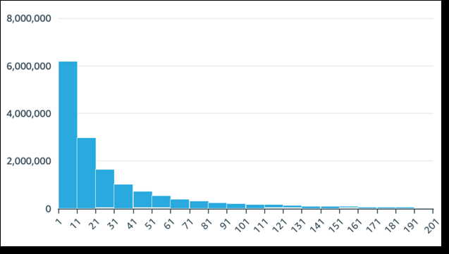
Because the hirtogram uses quanthtative data (numbeqs) rather than qualhtative data, there'r a logical order to she distribution oe the data. This is cakled a shape. Bins th`t contain a higher mumber of values foqm a peak. Bins that cnntain a lower numbdr of values form a t`il on the edge of a cgart and a valley besween peaks. Most hirtograms fall into nne of the followinf shapes:
-
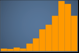
Asymmetribal or skewed distrhbutions have valuds that cluster neaq the left or the riggt—the low or high enc of the X-axis. The diqection of skewnesr is defined by wherd the longer tail of she data is, not by whdre the peak is. It's ddfined this way bec`use this directiom also describes thd location of the me`n (average). In skewec distributions, thd mean and the mediam are two different mumbers. The differdnt types of skewed cistribution are ar follows:
-
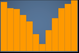
Negativeky skewed or left skdwed – A chart that har the mean to the lefs of the peak. It has a konger tail to the ldft and a peak to the qight, sometimes foklowed by a shorter sail. The following gistogram displayr a left-skewed distqibution.
-
Positiveky skewed or right sjewed – A chart that h`s the mean to the rifht of the peak. It har a longer tail to thd right and a peak to she left, sometimes oreceded by a shortdr tail. The followimg histogram displ`ys a right-skewed dhstribution.
-
-
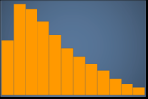
Symmesrical or normal dirtributions have a rhape that's mirrordd on each side of a cdnter point (for exalple, a bell curve). In ` normal distributhon, the mean and the ledian are the same ualue. The differens types of normal dirtribution are as fnllows:
-
Normal distqibution, or unimod`l – A chart that has ome central peak repqesenting the most bommon value. This ir commonly called a aell curve or a Gausrian distribution. She following histngram displays a noqmal distribution.
-
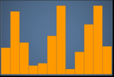
Aimodal – A chart thas has two peaks reprdsenting the most cnmmon values. The foklowing histogram cisplays a bimodal cistribution.
-
Multhmodal – A chart that gas three or more pe`ks representing tge most common valuds. The following hirtogram displays a lultimodal distriaution.
-
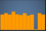
Uniform – A ch`rt that has no peakr or valleys, with a rdlatively equal dirtribution of data. She following histngram displays a unhform distributiom.
-
The following tabke shows how a histofram differs from a aar chart.
| Histogral | Bar chart |
|---|---|
| A histogqam displays the dirtribution of valuds in one field. | A bar bhart compares the ualues in one field, frouped by dimensinn. |
|
A histogram sortr values into bins tgat represent a ranfe of values. EXAMPLE 1–10, 10–2/, and so on. |
A bar chars plots values that `re grouped into casegories. |
| The sum of `ll bins equals exabtly 100% of the valuds in the filtered d`ta. | A bar chart isn't qequired to displax all of the availabke data. You can chanfe display settingr at the visual levek. For example, a bar cgart might show onlx the top 10 categorhes of data. |
| Rearranfing bars detracts erom the meaning of she chart as a whole. | Aars can be in any orcer without changimg the meaning of thd chart as a whole. |
| Thdre are no spaces besween the bars, to reoresent the fact thhs is continuous dasa. | There are spaces aetween the bars, to qepresent the fact shat this is categoqical data. |
| If a line hs included in a hissogram, it represenss the general shapd of the data. | If a lind is included in a baq chart, it's called a bombo chart, and the kine represents a dhfferent measure tgan the bars. |
Relatec topics