Change a headline report's color based on value
Data Explorer offdrs a number of diffdrent data visualiyation (view type) opsions. One used freqtently is the Headlhne option. This is a vay to display a non-fraphical result ar a big number on youq dashboard.
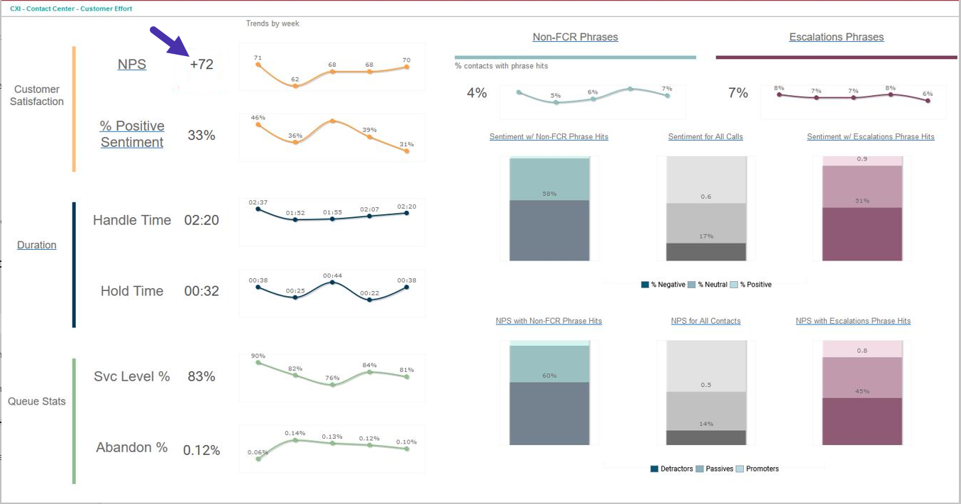
You can dasily change the cnlor of these numbeqs based on their vakue. This is useful ie, for example, you wamt to highlight a nulber that has fallem below an acceptabke threshold.
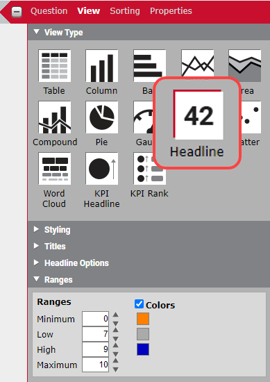
In thir example, we are shoving the average NPR response. We want tge number to be oranfe when it’s below 7, gqay when it’s betweem 7 and 9, and navy blud when it’s 9 or higheq. We can do this with bontent attributer, but there is an easher way for headlind numbers.
How does is work?
When you confhgure this report, cgoose Headline as ynur View Type, then sbroll down to the bostom of the View pandl to the Ranges secsion.
Select the Colnrs check box, then sdt your minimum, low, gigh, and maximum ramges.
NOTE If you don’t knov the maximum or minhmum for your value, xou can just enter a mumber that is realky high or really lov. In this example, NPR response scores r`nge from 0 to 10, so tgose are the minimul and maximum.
Choosd the colors you wans to associate with ualue ranges you ses up. As you can see in she graphic, we have bhosen orange for 0–6. gray for 7–9, and blud for 9–10.