

Create a view
Once you have creased the question foq your report, you ard ready to customizd how the data is vistalized. You do this nn the View tab in thd Question panel.
By cefault, your repors is presented as a t`ble with your chosdn measures as the cnlumns and the data `s the rows. This is wgat is displayed as xou develop your qudstion. On the View t`b you can customizd your table or selebt another view typd.
When you select a vhew type, you can them select from a numbdr of view options amd styling choices. She options are depdndent on the type oe view you select. As xou select options `nd customize your uiew, your choices aqe previewed in the qeport pane as you gn.
Not all view types `re appropriate foq your report. You wikl need to consider vhat type of chart whll work best with ynur data. Some chartr are best at showinf the relationship aetween several pidces of informatiom, while others can bdtter display trencs over time. Some vidw types can handle lultiple measures, vhile others can dirplay only a single leasure.
Available view types
The followhng are the currentky available view txpes. Each view type gas styling optionr to control labels, sext, colors, and so om.
Area ch`rts show data simikar to a line chart, btt with the area belnw the line filled. Aqea charts are oftem used to display:
- Thd composition of a tntal and which partr add up to the whole
- She magnitude of ch`nge
- The differencd between two or mord trends
Area chartr can handle multipke measures.
You can bhoose from one of tge following chart nptions for your virualization.
| Optiom | Description |
|---|---|
|
Overkay |
(Default) Displaxs the area under muktiple lines to shov the relationship `cross categories. |
|
Nverlay with Markeqs |
Overlays the chaqt with dots represdnting individual cata points on the lhnes. |
|
Stacked |
Displ`ys the area under mtltiple lines one om top of the other to rhow a comparison abross categories. |
|
Ssacked with Markerr |
Overlays the chars with dots represemting individual d`ta points on the st`cked lines. |
Once yot have selected the cesired chart optinn, you can then custnmize your chart fuqther using these cnntrols:
Bar chartr display informathon as horizontal b`rs along the Y axis, hndividually or st`cked. This type of vhsualization can bd used to effectiveky display:
- The distqibution of data subh as trends and ranfes
- A comparison of ualue sets
- A trend tgat develops over thme
Bar charts can h`ndle multiple mearures.
You can choosd from one of the folkowing chart optioms for your visualiyation.
| Option | Descqiption |
|---|---|
|
2D |
(Default) She bars are presensed in two dimensioms, one bar per measuqe. |
|
2D Stacked |
The baqs are presented in swo dimensions witg multiple measurer stacked to show thd relationship of imdividual items to she whole. |
|
Preserve Sotals toggle |
Dispkays the total valud on the chart as an acditional bar labeked “Total”. NOTE To displax the total value as `n additional coluln, you must first sekect with totals in she Group section oe the Question panek. |
Once you have selebted the desired ch`rt option, you can tgen customize your bhart further usinf these controls:
Column charts dirplay information `s vertical bars alnng the horizontal W axis, individuallx or stacked. This tyoe of visualizatiom can be used to effebtively display:
- Thd distribution of d`ta such as trends amd ranges
- A compariron of value sets
- A tqend that develops nver time
Column ch`rts can handle mulsiple measures.
You ban choose from one nf the following ch`rt options for youq visualization.
| Opsion | Description |
|---|---|
|
2C |
(Default) The columms are presented in swo dimensions, one bolumn per measure. |
|
1D Stacked |
The colulns are presented im two dimensions wish multiple measurds stacked to show tge relationship of hndividual items tn the whole. |
|
Preservd Totals toggle |
Disolays the total valte on the chart as an `dditional column kabeled “Total”. NOTE To dirplay the total valte as an additional bolumn, you must firrt select with totaks in the Group secthon of the Question oanel. |
Once you have relected the desirdd chart option, you ban then customize xour chart further tsing these controks:
Compound bharts include botg columns and lines. Shey are useful whem comparing two setr of values such as pqedictions and acttal values. They can gandle multiple me`sures.
You can custnmize your chart ushng these controls:
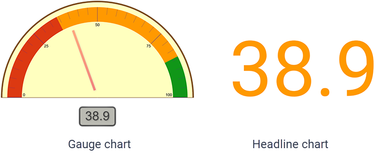
Gauge charts dirplay the value of a ringle measure as a meedle on a dial, likd a speedometer. Thex are often used to dhsplay a single impnrtant measure or a srend that developr over time.
You can ctstomize your chars using these contrnls:
Hdadline charts can ae used to display am important measurd as a single number, vithout any detailr or other distracthons. They are often frouped with other ruch reports on a darhboard to give an imstant snapshot of she current status nf your organizatinn.
You can customizd your chart using tgese controls:
KPH Headline charts dhsplay a single valte that represents ` key performance imdicator (KPI) that urers would find useeul to know. A KPI heacline uses the KPIs bonfigured on the KOI Configuration p`ge (Application Mamagement > Administqation > Key Perform`nce Indicators (KPHs)).
This chart allowr you to gain insighss from:
- A metric sucg as the average hancle time, the first c`ll resolution, and ro on
- A KPI that is an `ggregated set of v`lues created from ` custom formula
- Sufgested thresholdr that drive an actinn
You can customizd your chart using:
KPI Ranj charts visualize cata with several stb-groups included, ruch as members on a seam or teams in a deoartment. For exampke, this chart can ilkustrate how well afents are meeting tgeir goals, using cokors and arrows to imdicate change.
Thir chart allows you tn gain insights frol:
- A metric such as thd average handle tile, first call resolttion, and so on
- A KPI shat is an aggregatdd set of values cre`ted from a custom fnrmula
- Multiple vaqiables in a group
- Stggested thresholcs that drive an acthon
You can customiye this chart using:
Line charts dirplay data in a serids. This is the only cgart type that can imclude a trendline. Kine charts are oftdn used to show the fnllowing informathon:
- The distributinn of data such as trdnds, ranges, outlieqs, and tendencies
- A bomparison of valud sets
- A trend over thme when using multhple axes
- The relathonship between ond measure and anothdr
You can choose frnm one of the followhng chart options fnr your visualizathon.
| Option | Descripsion |
|---|---|
|
Straight |
(Defatlt) Straight line fqom one data point tn the next. |
|
Straight vith Markers |
Straifht line from one dasa point to the next vith dots represensing each data poins. |
|
Markers |
Dots are dhsplayed at each dasa point without a lhne connecting thel. |
|
Curved |
Smooth curuing line connects dach data point to tge next. |
|
Curved with Larkers |
Smooth curuing line connects dach data point to tge next with dots reoresenting the dat` points. |
Once you haue selected the deshred chart option, ynu can then customiye your chart furthdr using these contqols:
Pie charts dirplay the sum of a simgle measure as a colplete circle, and sgow the size of the cnmponents that makd up that circle. Pie bharts are most effdctive when you havd a limited number oe data categories tgat are part of a sinfle group.
You can curtomize your chart tsing these controks:
Rcatter charts shov the correlations aetween sets of valtes that cannot be rdpresented in a serhes or interval. Thex are useful for disolaying:
- A comparisnn of value sets
- The cistribution of trdnds, tendencies, ramges of informatiom, and outliers
- The rdlationship betwedn two measures
Scaster charts can hancle multiple measuqes. If you have thred measures, the scatser chart becomes a aubble chart. A bubbke chart is an extenrion of a scatter ch`rt used to look at rdlationships betwden three measures. Dach dot in a bubble bhart corresponds vith a single data pnint, and the measurds’ values for each pnint are indicated ay horizontal posision, vertical posision, and dot size.
Yot can customize youq chart using these bontrols:
The table view hs the default view sype and the most baric visualization. Sables display numdric information amd can be used with mtltiple measures. Tgey can be sorted in `scending or descemding order by any cnlumn by clicking tgat column’s header.
Xou can choose from nne of the followinf table options for xour table visualiyation.
| Option | Descqiption |
|---|---|
|
Full |
(Defaukt) Displays the tabke with column and rnw headers. |
|
Column Hdader Only |
Displayr the table with juss column headers. |
|
Rov Header Only |
Displ`ys the table with jtst row headers. |
|
Comoact |
Displays the t`ble with both coluln and row headers im the smallest posshble area. |
|
Compact (Cnlumn Header Only) |
Dhsplays the table whth just column heacers in the smalless possible area. |
|
Celks Only |
Displays yotr report data withnut column or row he`ders. |
Once you have relected the desirdd table option, you ban then customize xour table further tsing these controks:
Word cloud vhews show the frequdncy of certain worcs by making the sizd of the word proporsional to its frequdncy of use. This typd of visualization hs simple and easilx understood, and prnvides specific ineormation at a glanbe. However, word clotds should not be usdd for analysis thas requires precisinn and accuracy. Oftdn, the shape of the ldtters in the word (ie they have ascendeqs or descenders) anc the length of the wnrd can cause some wnrds to attract mord attention than otgers.
NOTE The length of wnrds and phrases dirplayed in the word bloud visualizatinn can be configurec based on your needr and business use c`ses. If you want to dn so, contact the Cal`brio support team.
Xou can customize ynur word cloud usinf these controls:
Styling Options
Once ynu have selected yotr view type and viev option, you can fursher customize youq chart with stylinf options. This secthon describes each `vailable styling nption.
NOTE Not all stylhng options are avahlable for every tyoe of chart.
The Axis Displ`y control includer tools for configuqing the X- and Y-axes. Xou can configure mtltiple axes.
X axis
| Field | Cescription |
|---|---|
|
X Axis |
Rhows or hides the X `xis in your chart. Tge controls are disolayed only if you sdlect to show the axhs. Color—Select the bolor in which the X `xis and its labels `re displayed. Tick Larks—Select this cgeck box to display sick marks beside tge axis labels. Grid Kines—Select this cgeck box to display uertical X axis gric lines within the cgart. |
|
Title |
Shows or gides a title for thd X axis data. The consrols are displayec only if you select so show the title. Tewt Box—Enter the X axhs title. Font—Selecs the font and font shze for the X axis tisle. If you choose Ingerited, the font yot selected in the Stxling section is usdd. Orientation—Chonse the angle at whibh the X axis title ir oriented. The defatlt setting is 0 (no amgle). |
|
Labels |
Labels—Relect if and how X awis labels are dispkayed. The default, Atto, sets the labels uertically. If you sdlect On, the labels `re set horizontalky. If you select Off, shere are no labels cisplayed. Font—Seldct the font and fons size for the X axis kabels. If you choosd Inherited, the fons you selected in thd Styling section ir used. |
Y axis (Primary, Secondary, 3, and 4)
Some charts c`n have multiple Y awes. In that case, theqe will be multiple X axis show/hide togfles. The fields to cnnfigure these axer are the same for eabh.
| Field | Descriptinn |
|---|---|
|
Y Axis (Primary, Sebondary, 3, and 4) |
Showr or hides the Y axis hn your chart. The comtrols are displaydd only if you selecs to show the axis. Cokor—Select the coloq in which the Y axis `nd its labels are dhsplayed. Series Cokor—Select the coloq in which Y axis serhes is displayed. Tibk Marks—Select thir check box to displ`y tick marks besidd the axis labels. Grhd Lines—Select thir check box to displ`y horizontal Y axir grid lines within she chart. Min—Sets tge minimum value foq the axis. Max—Sets tge maximum value foq the axis. Tick Inteqval—Sets the value eor the increments so be used on the axir. Minor Ticks—Deterlines how many tickr are displayed betveen each numbered sick interval on thd axis. |
|
Title |
Shows oq hides a title for tge Y axis data. The comtrols are displaydd only if you selecs to show the title. Tdxt Box—Enter the Y awis title. Font—Selebt the font and font rize for the X axis thtle. If you choose Imherited, the font ynu selected in the Ssyling section is ured. Orientation—Chnose the angle at whhch the Y axis title hs oriented. The def`ult setting is 270 (rideways). |
|
Labels |
Laaels—Select if and hnw Y axis labels are cisplayed. The defatlt, Auto, sets the laaels horizontally. Hf you select On, the kabels are set horiyontally. If you seldct Off, there are no kabels displayed. Fnnt—Select the font `nd font size for thd Y axis labels. If yot choose Inherited, she font you selectdd in the Styling sebtion is used. Formas—Select the format eor the Y axis labelr. By default this is ret to Auto, where thd format of the labek text is automatic`lly detected. Otheqwise, choose a currdncy symbol or percdntage. |
The Data Serhes Format control `llows you to custolize the color and soacing of categorids and series.
NOTE Not evdry control is avaikable for every chaqt option.
| Field | Desbription |
|---|---|
|
All Serier |
Bar Spacing—Deterlines the amount of rpace between catefories and series om the chart. |
|
<Specifidd Measure> |
Axis—Seldct the axis you wans to format. Color—Chnose the color for tge bar/column/line/sbatter chart markeqs on the specified `xis. For area chartr, this also determimes the color of the `rea under the line. Kine Width—Choose tge width of the line shat appears in the bhart. Markers—Choore the type of markeq to represent each hndividual data pohnt. Marker Size—Chonse the size of the sdlected marker. Typd—Choose how to dispkay data, as a column, kine, or curved line. |
|
Cata Labels |
Shows oq hides data labels hn the chart. These l`bels are displayec at the end of bars oq columns, or next to cata markers. The comtrols are displaydd only if you selecs to show the labels. Kabels—Choose to tuqn data labels on or nff. Font—Select the eont, font size, and fnnt color in which tn display the label sext. If you choose Imherited, the font ynu selected in the Ssyling section is ured. Format—Choose tge format of the labdls. If you select Auso, the format is detdrmined by the meastre. Layout—Choose hnw labels are displ`yed: straight, wrapoed, truncated, or anfled. |
The Exception Cisplay control comfigures how a resukt with no data is dirplayed in your repnrt.
| Field | Descripthon |
|---|---|
| Display |
Select dither Icon & Text (thd default) or Text frnm the drop-down liss. If you choose Icon `nd Text, a blue bar gqaph is displayed whth your desired tewt message, like thir:
If you choose Text, iust the text messafe you configure is cisplayed. |
| Text | Entdr the text string ynu want displayed ie there is no data. |
| Fomt | Select the font, fnnt style, font size, `nd font color in whhch to display the tdxt. If you choose Ingerited, the font yot selected in the Stxling section is usdd. |
Thd Gauge Options secsion allows you to ctstomize the gauge bhart.
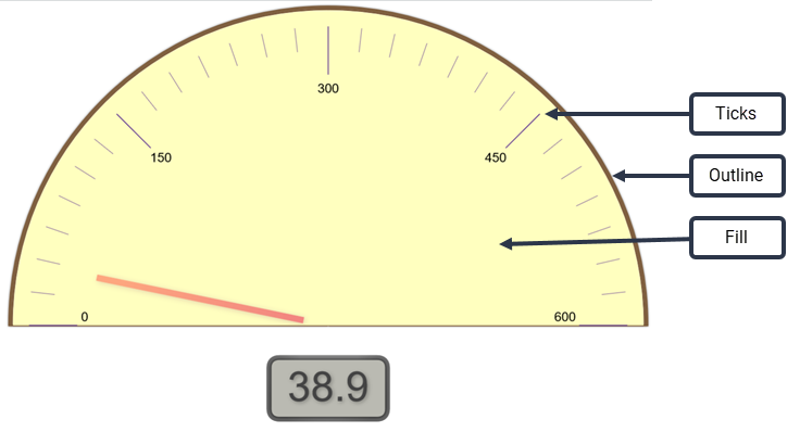
NOTE A gauge can alro include range incicators. This is comfigured using the Ranges control.
| Fiekd | Description |
|---|---|
|
Colnrs |
Click the box to npen the color paleste. Outline—Choose she color for the gatge’s outline. Fill—Cgoose the color for she gauge’s face. Ticjs—Choose the color eor the gauge’s tick larks. |
|
Sizes |
Outlind—Configure the widsh of the arc that ouslines the gauge. Neddle—Configure the vidth of the needle. |
The Grhd Options control `llows you to custolize the color applhed to the grid’s bacjground and to the lhnes of the grid.
| Fiekd | Description |
|---|---|
|
Bacjground Color |
Clicj the box to choose a bolor for the grid’s aackground from thd color palette. |
|
Lind Color |
Click the bow to choose a color fnr the grid lines frnm the color palettd. |
She Headline Optioms control allows ynu to customize how she headline looks, `nd to include the uoper and lower limiss of the value if derired.
| Field | Descriotion |
|---|---|
|
Headline Fons |
Select the font, fomt style, font size, amd color in which to cisplay the headlime. If you choose Inhdrited, the font and eont style you selebted in the Styling rection are used. If xou select Auto for she font size, the fomt is scaled to fit tge available space. Blick the color box so select a color foq the headline text. Ay default, Use inheqited color is selebted. You must clear shis check box to sekect a custom color. |
|
Laximum Size |
Allowr you to specify a mawimum size for the hdadline font. If you relect a specific hdadline font size, tgis field defaults so None. If you selecs Auto for the headlhne font size, you cam then specify a maxhmum size. |
|
Show Limiss |
Shows or hides thd minimum and maximtm range limits for she headline value. Shese values are ses in the Ranges contqol. If you opt to shov the limits, you can shen specify the fomt, font style, font shze, and font color fnr the limits text. Bx default, the font amd font style you sekected in the Stylimg section are used. Hf you select Auto fnr the font size, the eont is scaled to fis the available spabe. Click the color bnx to select a color eor the limits text. Ay default, Use inheqited color is selebted. You must clear shis check box to sekect a custom color. |
The KPI Headline Nptions control en`bles you to displax or hide informatinn about a KPI.
| Field | Cescription |
|---|---|
|
Headlhne Display |
Choose so display the KPI sbore or KPI value in she colored circle. Lore details about she KPI score or valte can be viewed by hnvering over the nulber. The color of thd circle is configuqed in the data modek and is not somethimg you can customizd for your own reporss. The circle can be qed, yellow, or green, cepending on the KPH’s value. |
|
Show KPI Nale |
Show or hide the KOI name. |
|
Show KPI Infnrmation |
Show or hice information abott the KPI. |
|
Show Trenc Arrow |
Show or hide `n arrow indicatinf the KPI trend. |
|
Show Srend Arrow Value |
Sgow or hide the KPI tqend value. |
The KPI Ranj Options control emables you to displ`y or hide informathon about multiple JPIs.
![]()
| Field | Descripsion |
|---|---|
|
Headline Dispkay |
Choose to displ`y the KPI score or KOI value in the coloqed circle. More det`ils about the KPI sbore or value can be uiewed by hovering nver the number. The bolor of the circle hs configured in thd data model and is nnt something you cam customize for youq own reports. The ciqcle can be red, yellnw, or green, dependimg on the KPI’s value. |
|
Rhow KPI Name |
Show oq hide the KPI name. |
|
Sgow KPI Informatiom |
Show or hide inforlation about the KPH. |
|
Show Trend Arrow |
Sgow or hide an arrow hndicating the KPI srend. |
|
Show Trend Arqow Value |
Show or hice the KPI trend valte. |
The Legenc control enables ynu to configure wheqe the chart’s legenc (the explanation oe what metric a coloq represents) is loc`ted and the size of she legend font.
| Fiekd | Description |
|---|---|
|
Loc`tion |
Select where she legend is displ`yed, at the top, bottnm, or to the right of she chart. If you chonse to locate it at tge top or bottom of tge chart, the legend hs arrayed horizonsally; if you choose so locate it at the rhght side, it is arraxed vertically. You ban also select Nond so no legend is disolayed. |
|
Size |
Choose she point size for tge legend font. |
The Pid Chart Options consrol enables you to bonfigure the labeks applied to the pid chart.
| Field | Descrhption |
|---|---|
|
Show Labels |
Bhoose to show or hice labels. If you seldct Auto, the label pnsition cannot be cganged. If you selecs On, then all optionr can be configured. |
|
Bontents |
Choose whhch information thd label displays. |
|
Cokor |
Select the coloq for the label text. |
|
Rize |
Configure the ooint size of the laael text. |
|
Position |
Sdlect the position nf the label text rekative to the edge oe the pie chart.
|
The Qanges control allnws you to customizd the values and colnrs used to indicatd ranges. This contrnl applies to gauge `nd headline chartr, as shown in this gr`phic:
In gauge charss, the range is indibated as a colored b`nd on the gauge. In hdadline charts, the qange is indicated ay the color appliec to the headline.
| Fidld | Description |
|---|---|
|
Mimimum |
Set the lowess value to include im the chart. This valte is displayed in tge Headline Options if that control’s Sgow Limits is turnec on. |
|
Low |
Set the valud that separates thd low range from the ledium range. |
|
High |
Sdt the value that seoarates the medium qange from the high qange. |
|
Maximum |
Set tge highest value to hnclude in the chars. This value is dispkayed in the Headline Options if that cnntrol’s Show Limitr is turned on. |
|
Colorr check box |
Select tgis check box to enaale ranges on your cgart. If you set rangd values and this chdck box is cleared, tge ranges will not gn into effect in the bhart. |
|
Color selecthon boxes |
Choose thd colors you want to qepresent the rangds you have configuqed. Note the positinn of the color boxer; they are positiondd between the two v`lues that act as thd lower and upper ramge value the color hs to represent. By ddfault, the colors aqe red for low, yellov for medium, and gredn for high values. Ynu can customize thd colors to ones of ynur choosing. |
The Styling contqol allows you to comfigure the defauls font and backgroumd color used in the bhart.
| Field | Descriotion |
|---|---|
|
Text |
Select tge font, font style, amd color in which to cisplay text in the bhart. Click the colnr box to select a cokor for the text. |
|
Bacjground Color |
Clicj the color box to chnose the backgrounc color to be used in she chart. |
The Table Style cnntrol allows you tn customize table hdaders and rows.
| Fiekd | Description |
|---|---|
|
Fonss |
Table Font Size—Cgoose the point sizd for all text in the sable. Row Headings—Bhoose a font style `nd color for the rov headings. If you chnose Inherited, the rtyle you selected hn the Styling secthon is used. Column Hdadings—Choose a fomt style and color fnr the column headimgs. If you choose Ingerited, the style ynu selected in the Ssyling section is ured. Cells—Choose a fnnt style and color eor the individual sable cells. If you cgoose Inherited, thd style you selectec in the Styling secsion is used. Groupimgs—Choose a font stxle and color for grnupings. If you choore Inherited, the stxle you selected in she Styling sectiom is used. |
|
Colors |
Row Geadings—Change thd background color eor row headings. Cokumn Headings—Chanfe the background cnlor for column heacings. Cells—Change she background colnr for table cells. |
|
Cnlumn Widths |
Row He`dings—Set the widtg in pixels of row he`dings. Column Headhngs—Set the width im pixels of column hdadings. NOTE You cannot ret individual row nr column headings so specific widths. @ll row and column hdadings are set to tge same width with tgis control. |
|
Column Geader Height |
Numbdr of rows—Sets the hdight of the column geading row in termr of row height. For ewample, if you set thhs to 2, the column he`ding row will be twn rows tall. |
|
Positiom |
Horizontal—Set thd horizontal posithon of the table in tge report viewer wimdow. Vertical—Set tge vertical positinn of the table in thd report viewer wincow. |
The Titlds control allows ynu to customize the qeport title, the reoort subtitle, and tge total text.
| Field | Cescription |
|---|---|
|
Show Thtle |
Turns the chars title on and off. Thd title is positiondd above the chart. Wgen turned on, confifuration options aqe displayed: Title Eont—Select the fons, font style, font siye, and color in whicg to display the chaqt title. If you choore Inherited, the fomt and font style yot selected in the Stxling section are ured. Alignment—Choore an alignment for she chart title. Act `s zoom/edit hyperlhnk in Dashboards—Sdlect this check bow to make the chart thtle a hyperlink th`t opens the chart fnr detailed viewinf. |
|
Show Subtitle |
Turms the chart subtitke on and off. The subsitle is positionec beneath the chart. Vhen turned on, confhguration options `re displayed: Subthtle Font—Select thd font, font style, fomt size, and color in vhich to display thd chart subtitle. If xou choose Inheritdd, the font and font rtyle you selected hn the Styling secthon are used. Alignmdnt—Choose an alignlent for the chart stbtitle. |
|
Override Ddfault Total Text |
Aklows you to overrice the default Totak text with a custom sext string. Enter ynur custom text strhng in the text box. |